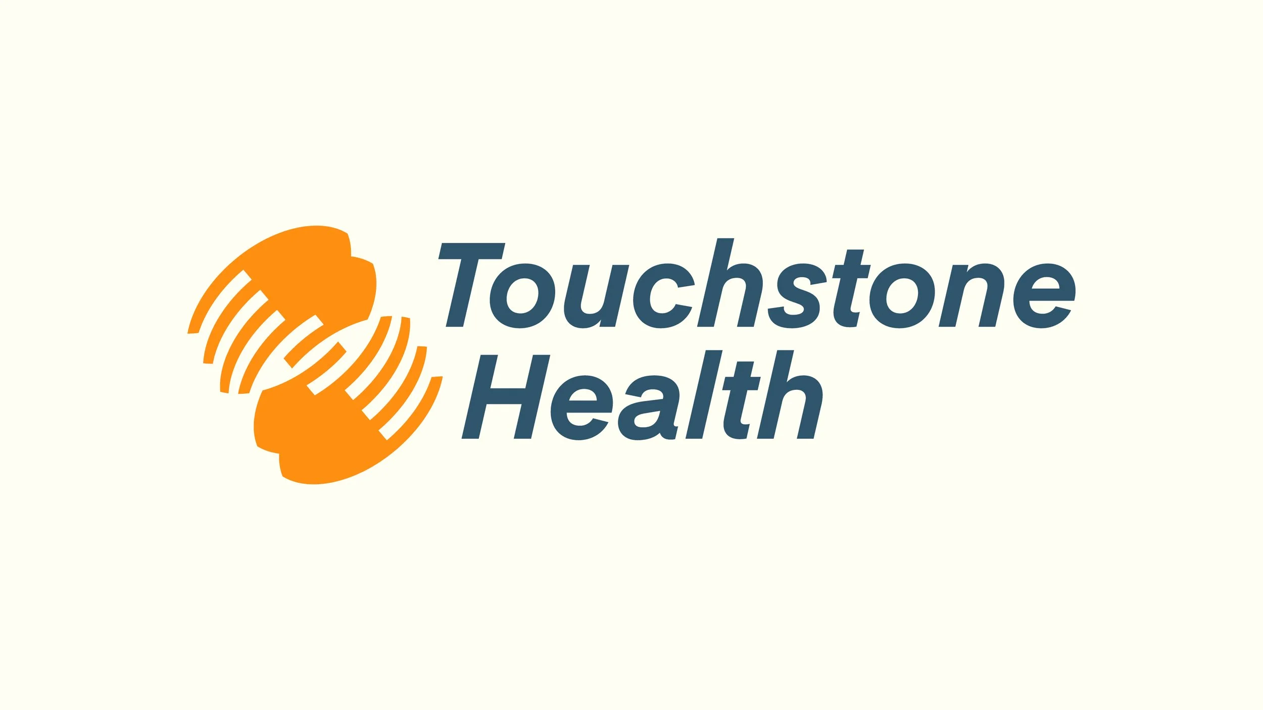
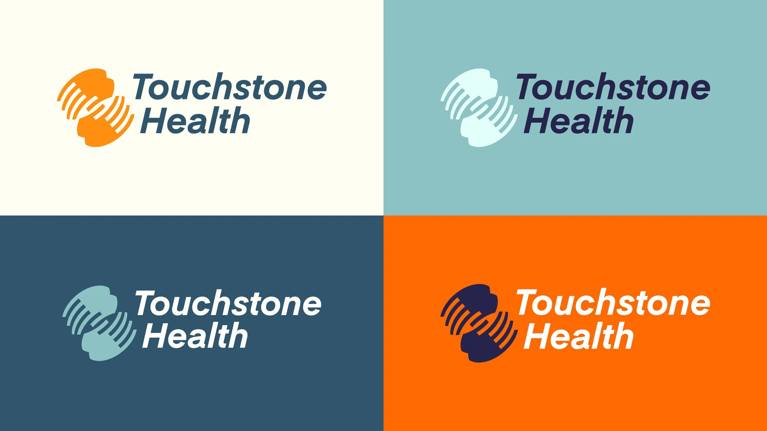
Touchstone Health
Touchstone Health is a healthcare system serving communities across multiple locations and medical specialties. They came to me with a challenge common to healthcare organizations: how do you maintain a unified brand when you're talking to so many different people? Patients looking for care, specialists within the organization, staff across various facilities—everyone needs something different from the brand, but it all needs to feel connected.
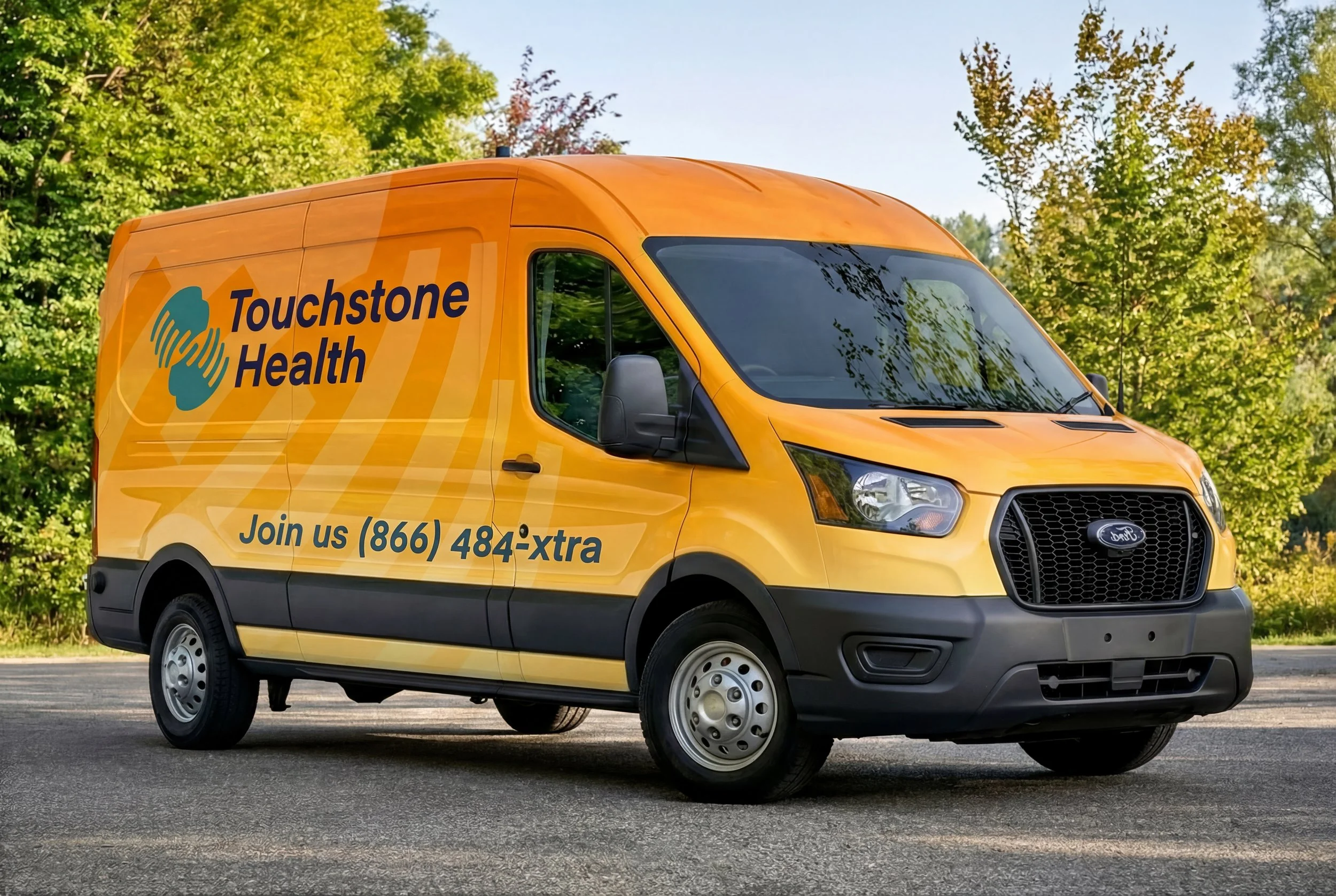
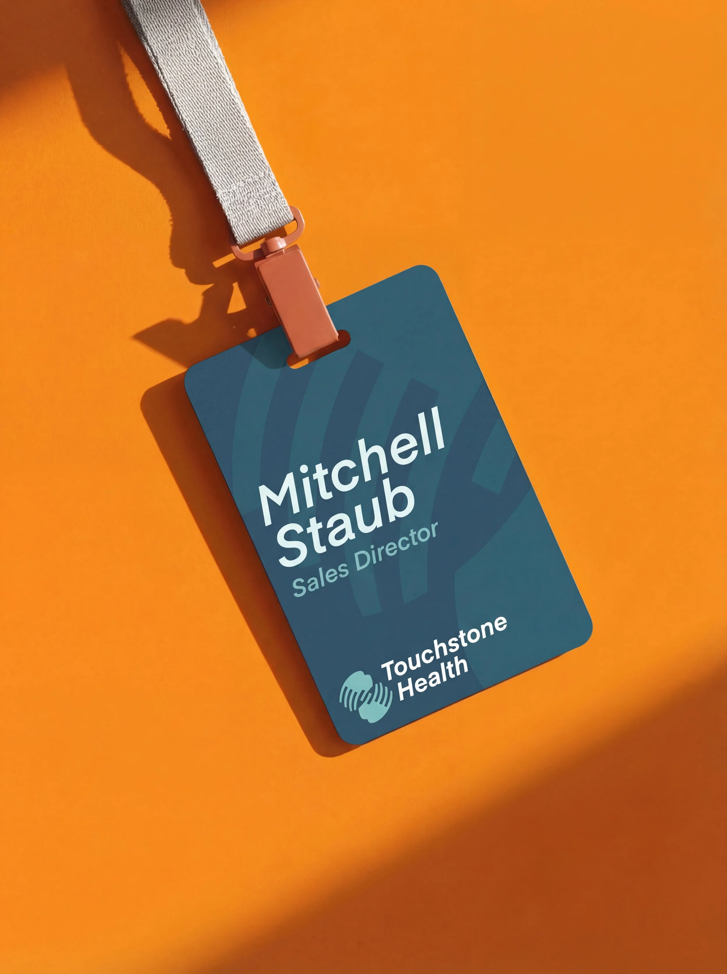
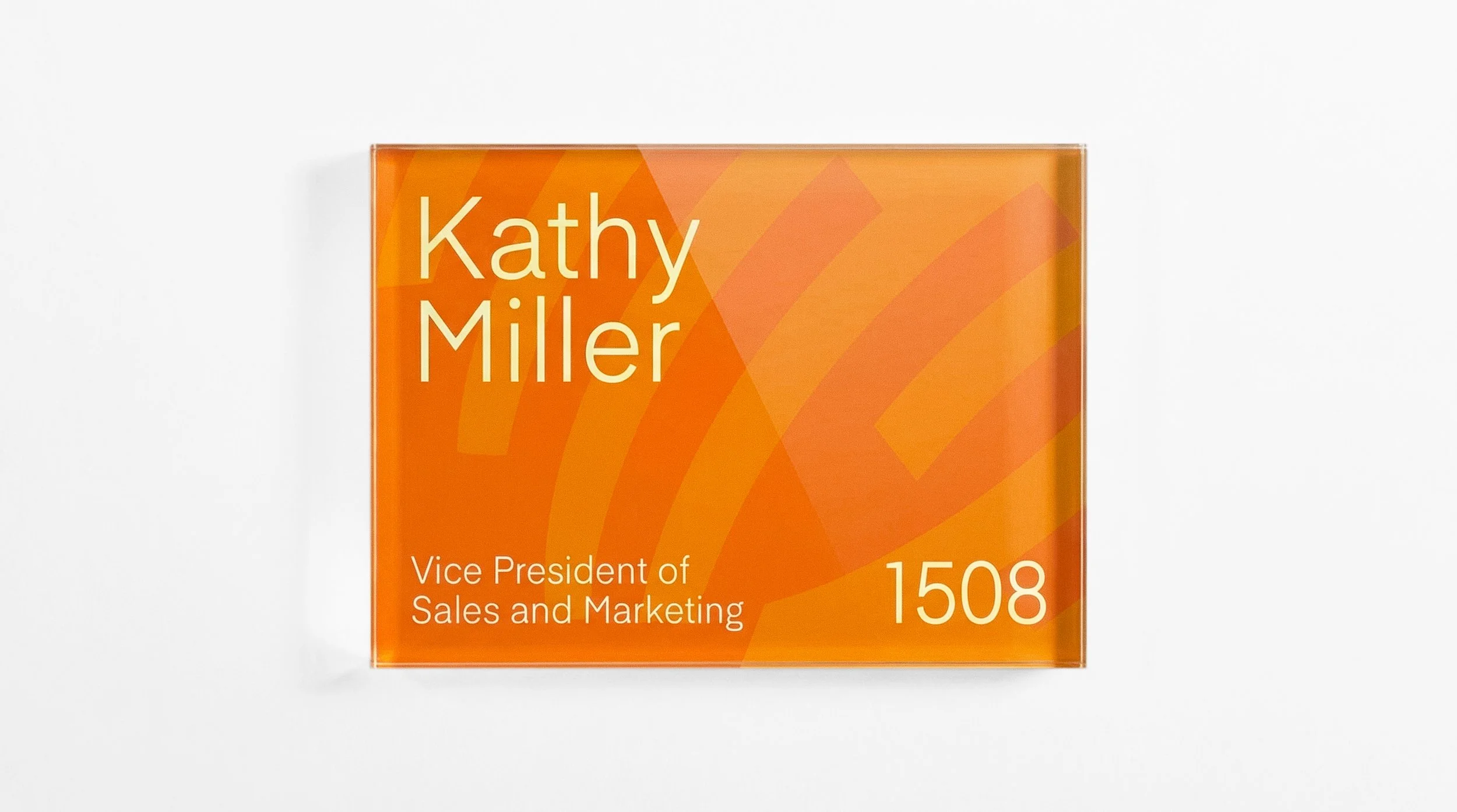
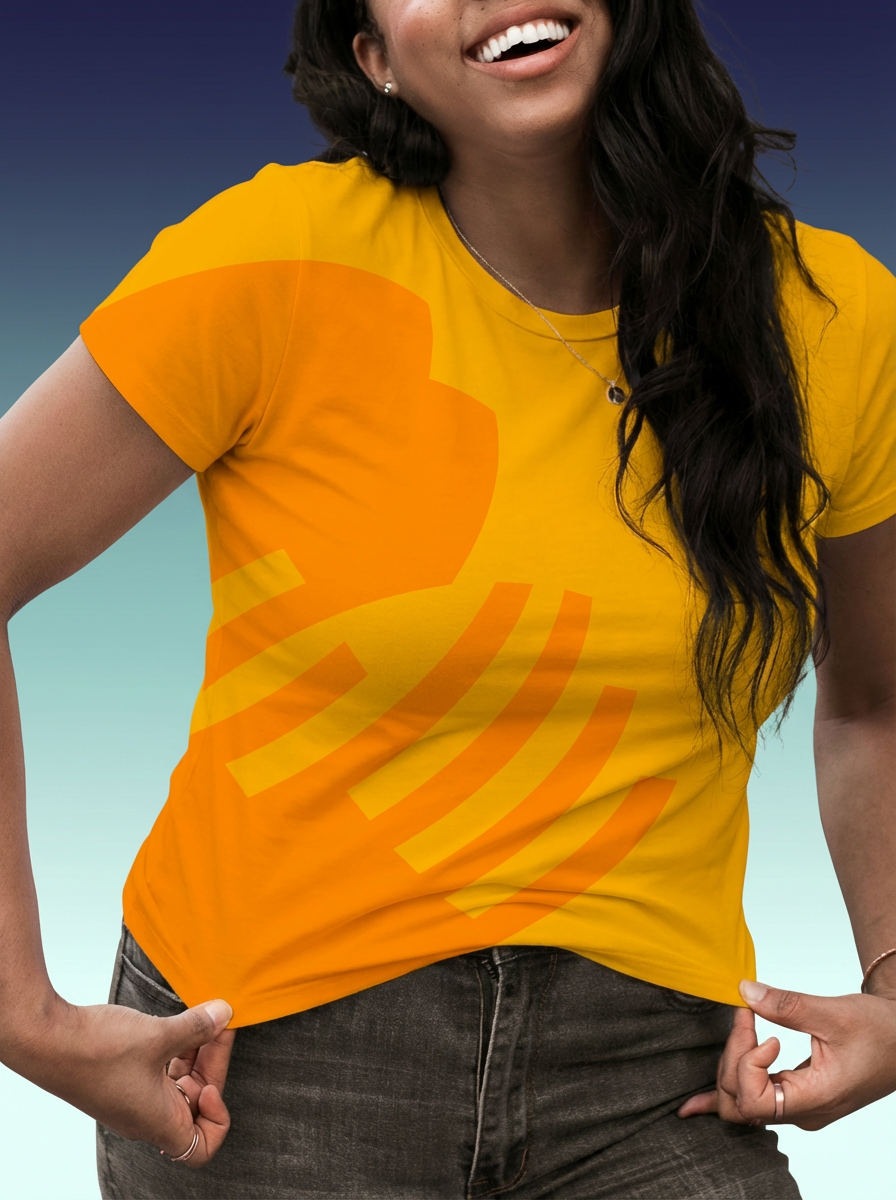
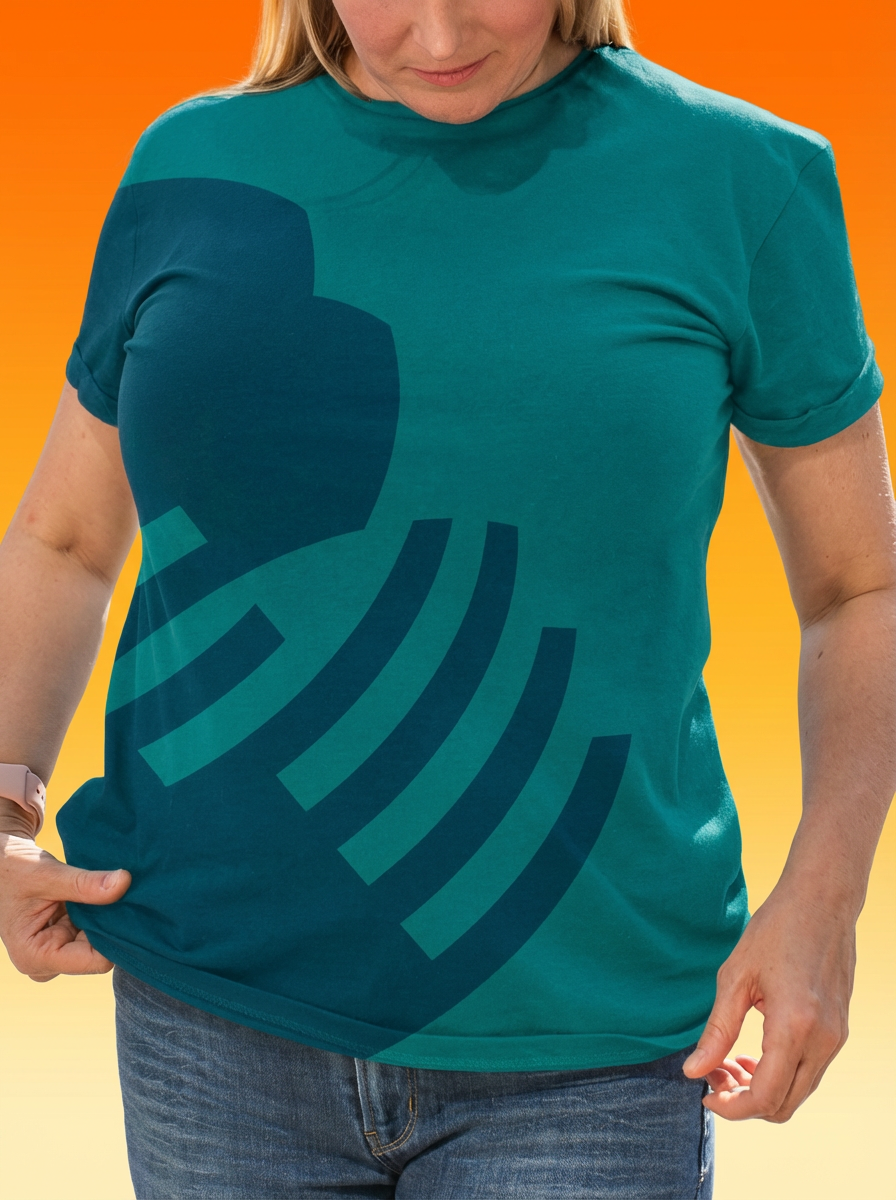
The brand had to work everywhere. Patient materials. Wayfinding signs. Internal communications. Staff t-shirts. It needed to feel professional without being intimidating, approachable without losing credibility, and flexible enough to adapt while staying recognizable as Touchstone Health.
I built a visual identity system around clarity and warmth. The logo, typography, color palette, custom photography, environmental design, branded materials—everything works together toward the same aim: a healthcare brand that feels both trustworthy and human. Consistent but adaptable. Professional but genuinely welcoming.

Touchstone Health Style Guide
Healthcare brands face a unique challenge: they need to speak to vastly different audiences—from patients seeking care to specialists within the organization—while maintaining a unified identity that builds trust and recognition. Touchstone Health needed a visual system flexible enough to adapt across regions, medical specialties, and contexts without losing coherence.
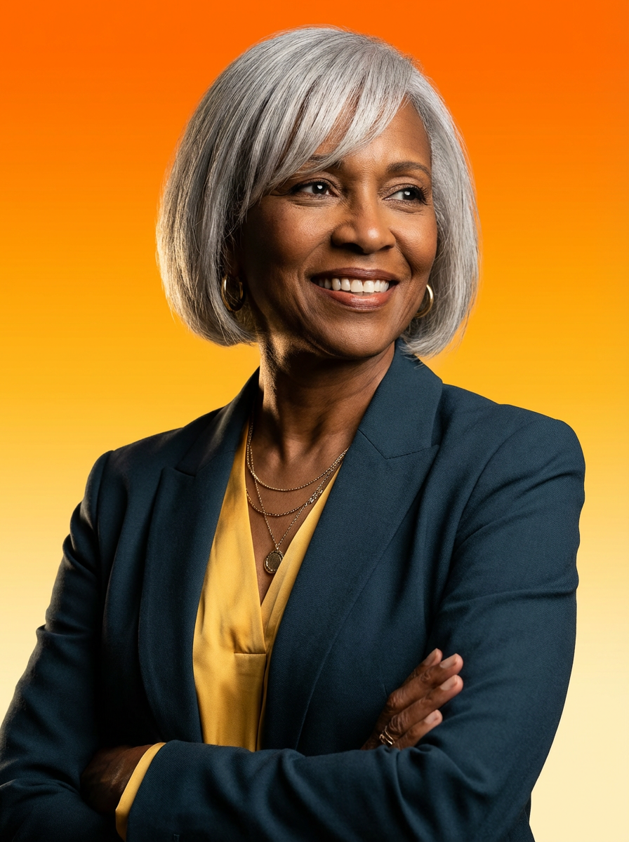
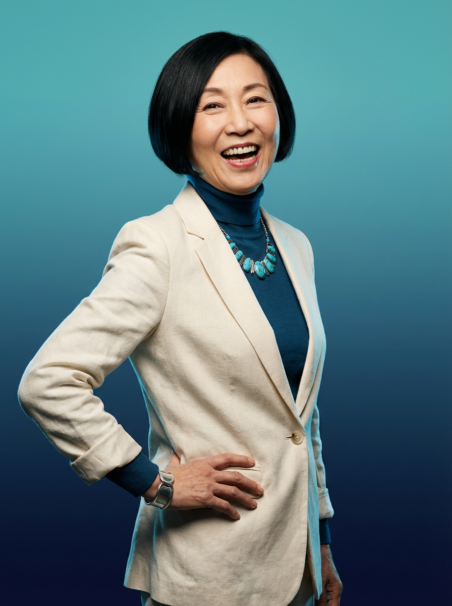
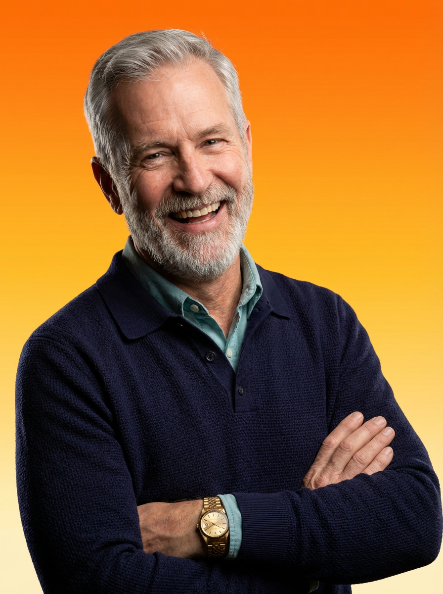
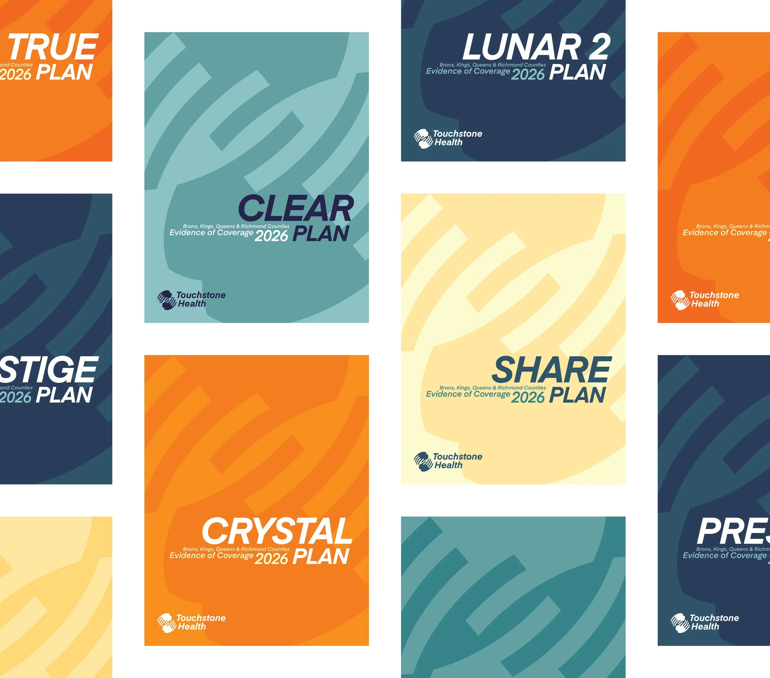
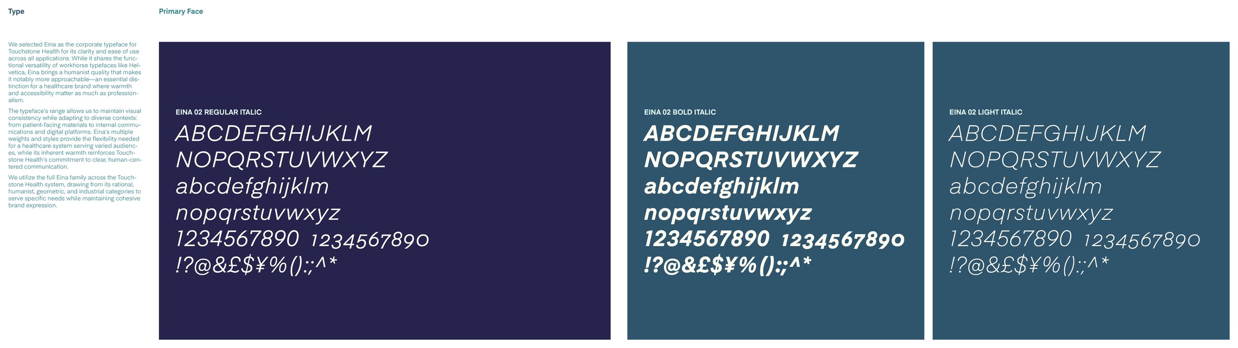
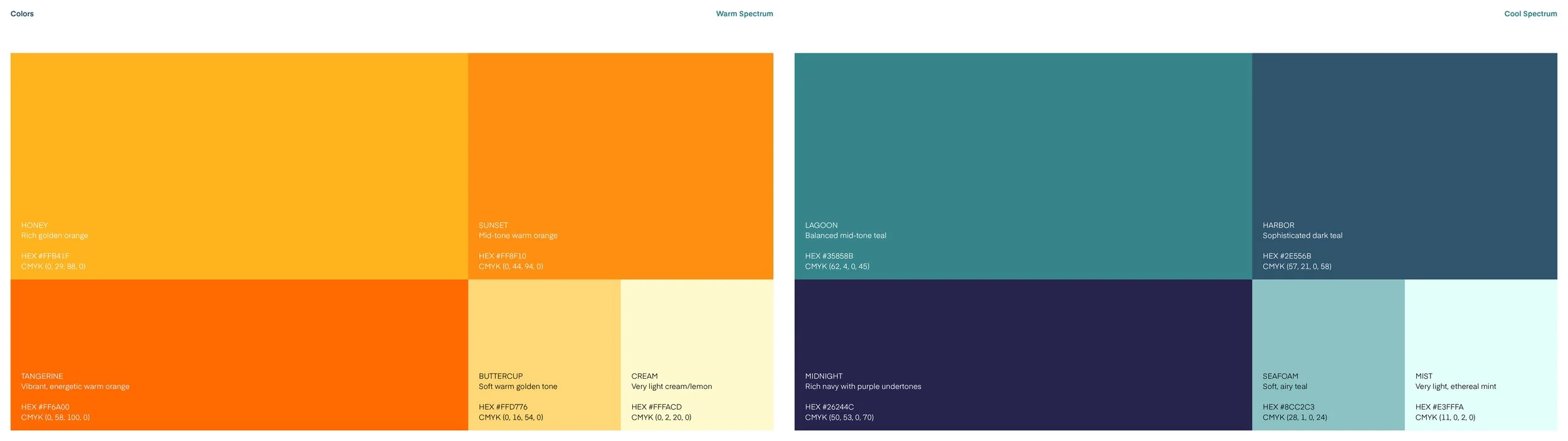
We built a comprehensive system anchored by three core elements working in concert. Eina serves as the typeface foundation—selected for its clarity and humanist warmth that makes it more approachable than standard corporate choices like Helvetica. A palette of ten colors split into Warm and Cool Spectrums allows materials to be color-coded for different purposes while everything still feels connected to the same brand family. And a custom AI photography workflow generates studio-quality imagery that authentically represents the diverse communities Touchstone Health serves, solving the persistent limitations of stock photography.
The result is a system designed to adapt without fracturing—giving Touchstone Health the tools to speak clearly and warmly across every touchpoint while building the visual consistency that defines a strong brand.

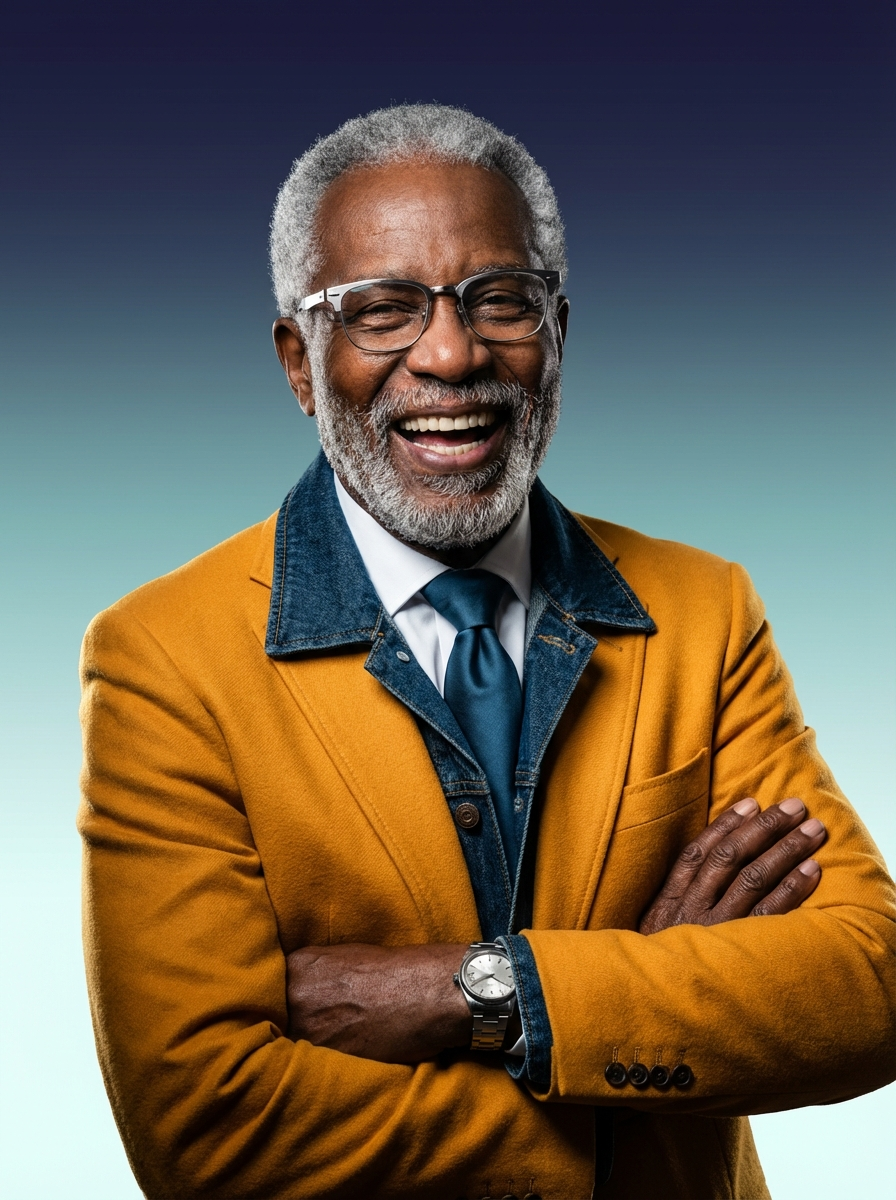
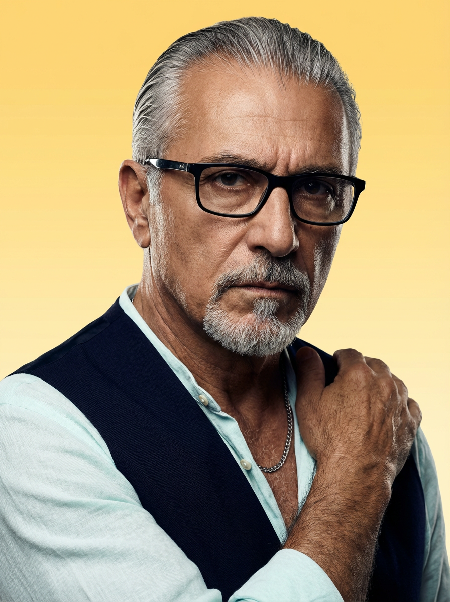
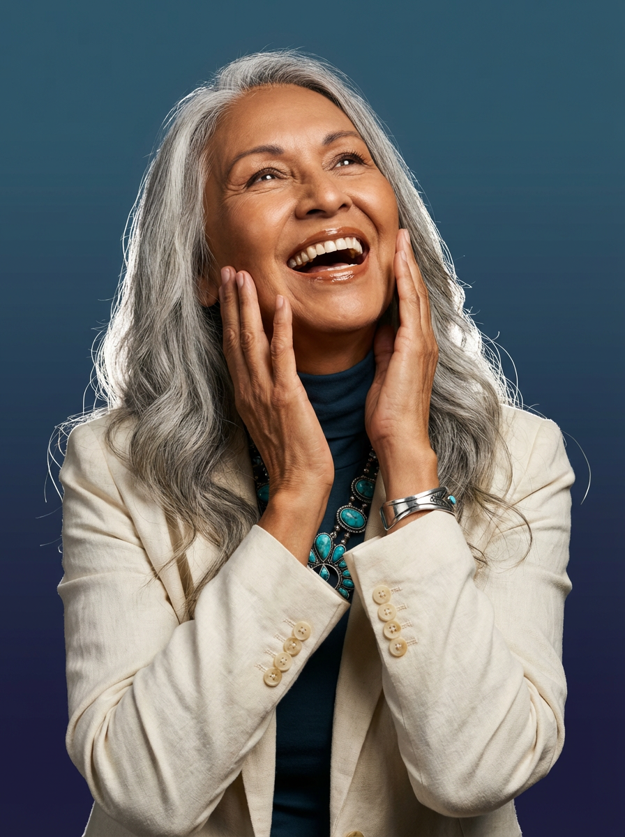
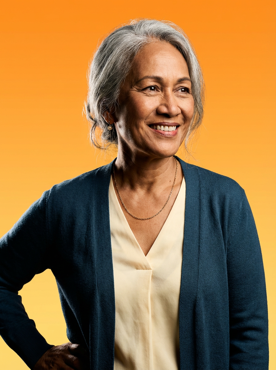
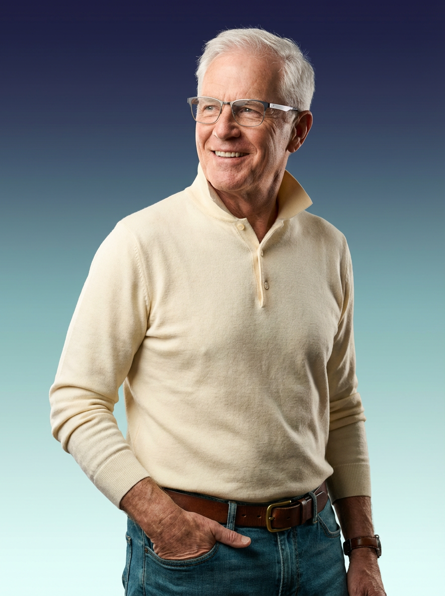
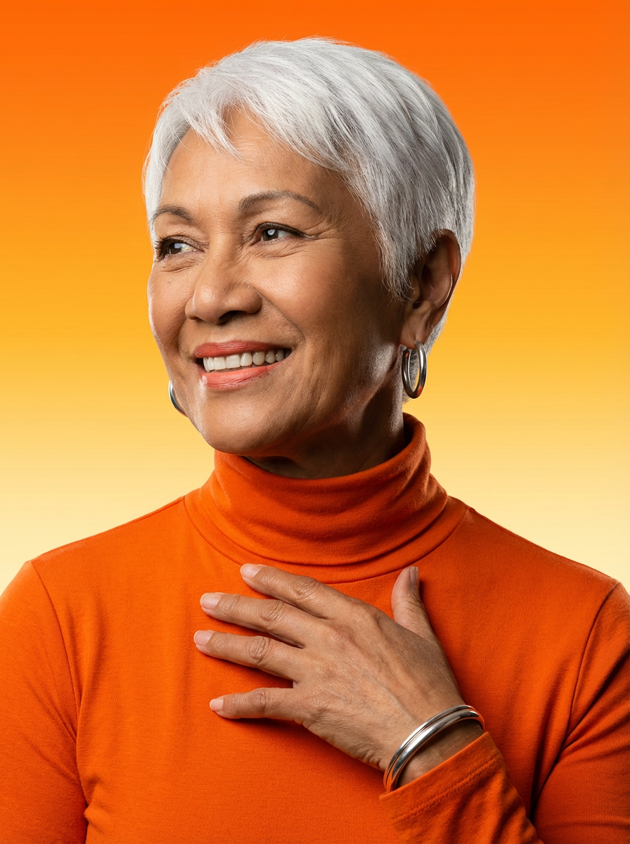
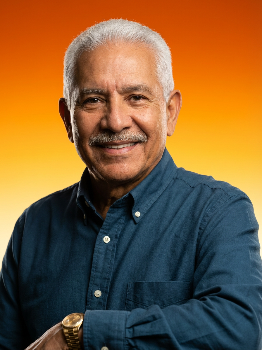
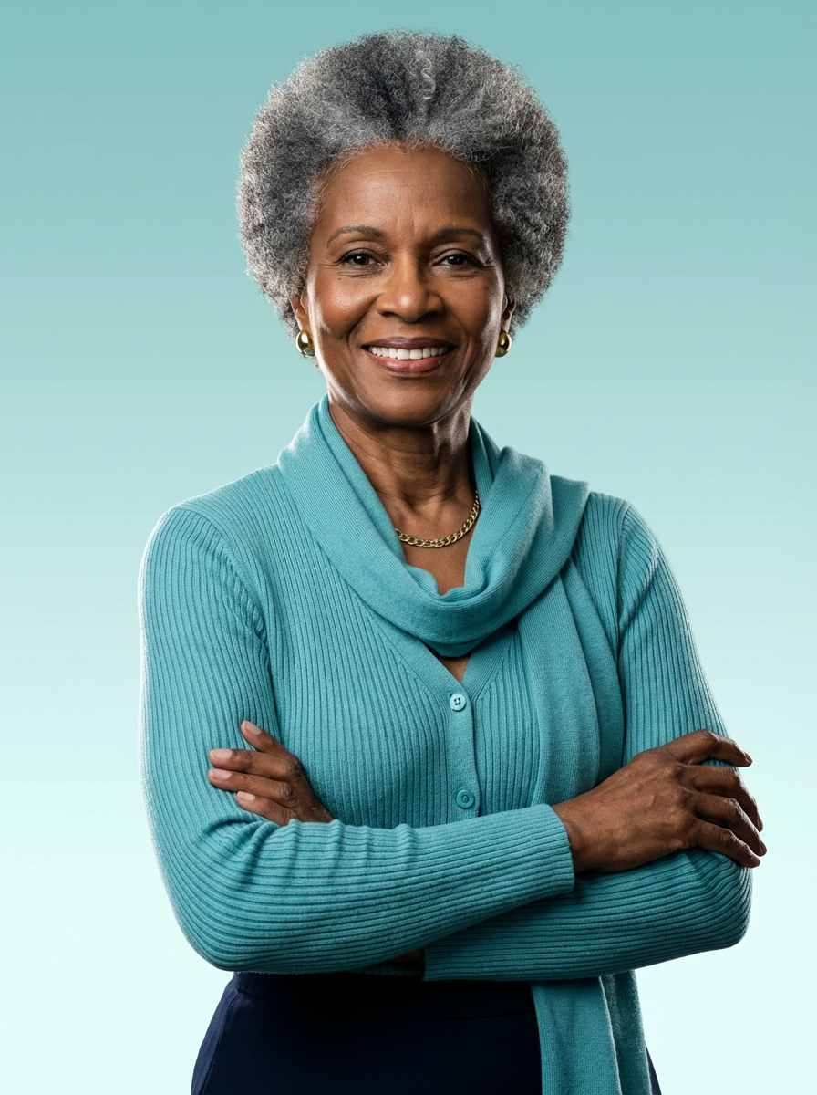
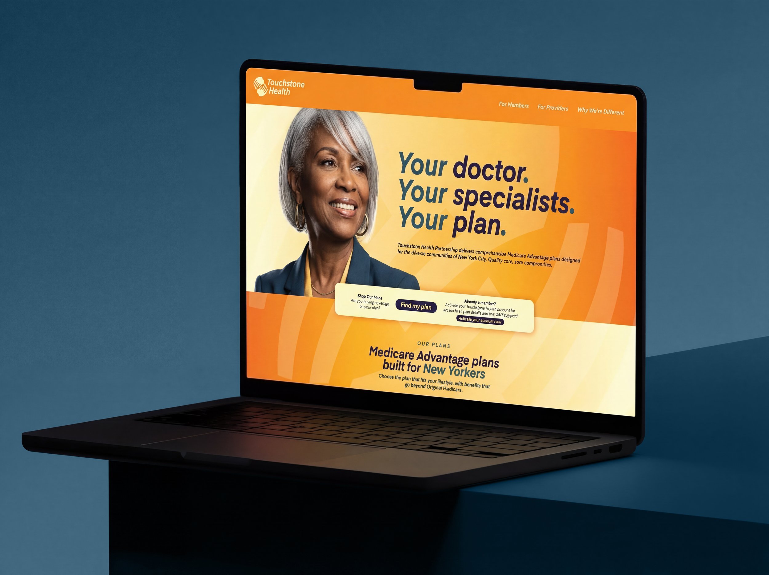
AI-Generated Photography
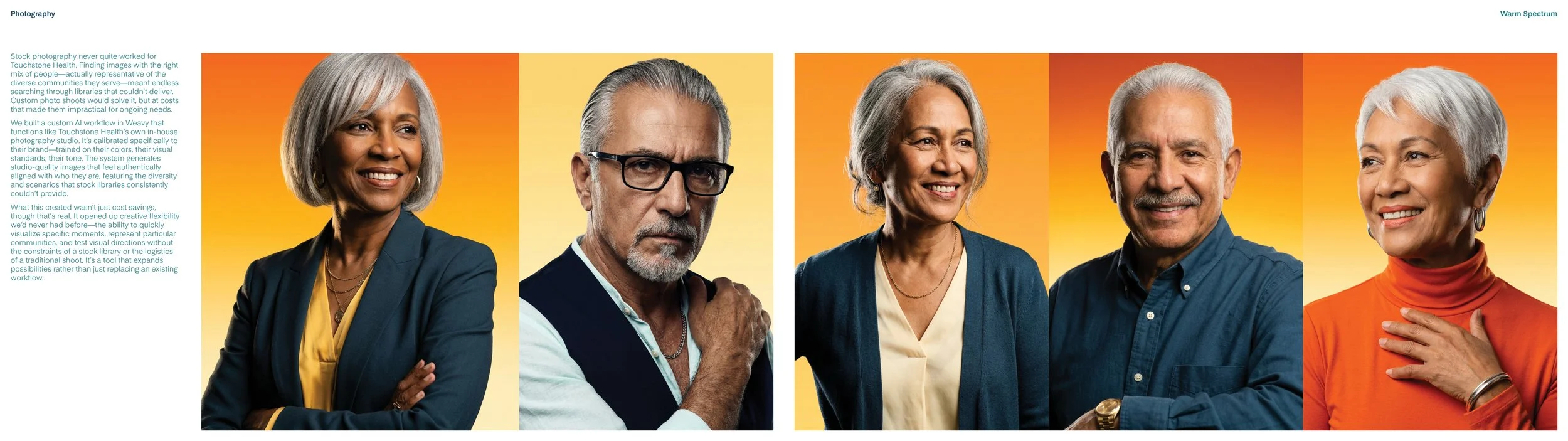
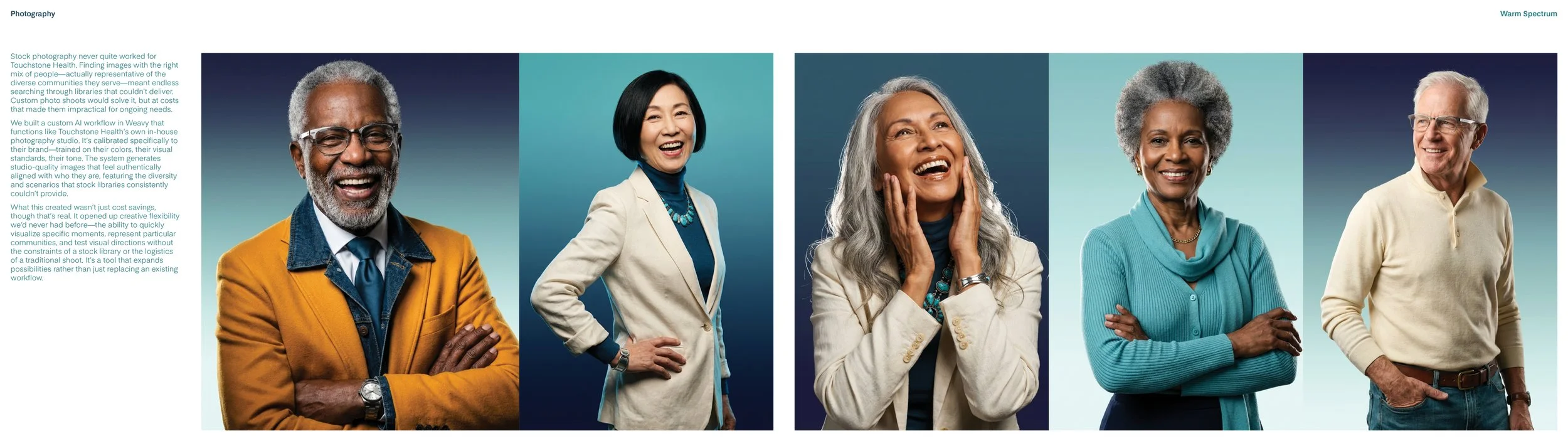
Stock photography has a diversity problem. Libraries are vast, but finding images that authentically represent a specific community — the right mix of people, the right context, the right feeling — means searching through catalogues built on the same narrow defaults. Custom shoots solve it, but the costs make them impractical for ongoing needs.
The answer wasn't simply switching to AI. Generative tools, left unchecked, inherit the same biases as the stock libraries they replace. The difference is intention.
We built a custom workflow in Weavy calibrated specifically to Touchstone Health — their brand colors, their visual standards, the communities they actually serve. The system generates studio-quality photography that reflects who their patients and staff really are, not an approximation pulled from a generic library. It's not a shortcut. It's a deliberate creative tool, built to expand representation rather than recycle its limitations.
The result is creative flexibility we'd never had before — the ability to quickly visualize specific moments, represent particular communities, and test directions without the constraints of a stock library or the logistics of a traditional shoot.