Twin Peaks: The Return
Twin Peaks: The Return wasn’t a reboot. It was a resurrection. 25 years of mythology returning to television on its own terms, directed entirely by David Lynch. The creative mandate was uncompromising: honor the iconography without nostalgia-trapping it. The process was deeply collaborative with Lynch throughout.
Key Art / Campaign
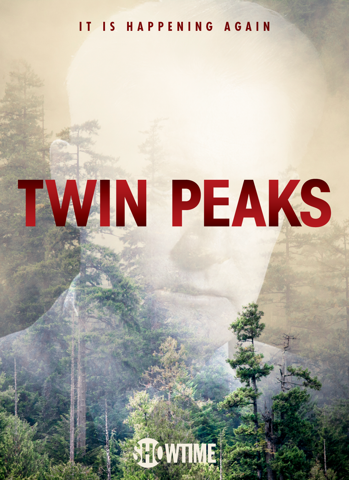
The key art used two images: the iconic Laura Palmer photograph, licensed from ABC, and an original shot of Agent Cooper. No current photography. No new shoots. Both images had accrued cultural weight over 25 years. The decision was to let that weight carry the campaign.
Lynch was specific about what the marketing should not do. No clever visual puns. Nothing that reduced his vision to parody. And nothing that looked like key art. The creative had to feel like it came straight out of the show’s world-building, not developed outside it looking in.
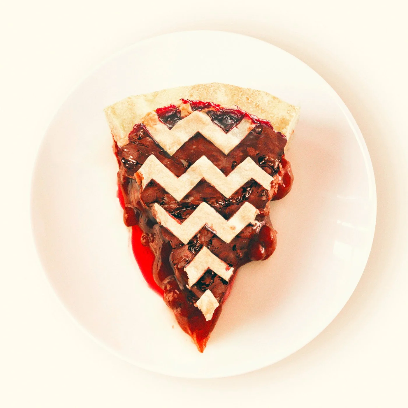
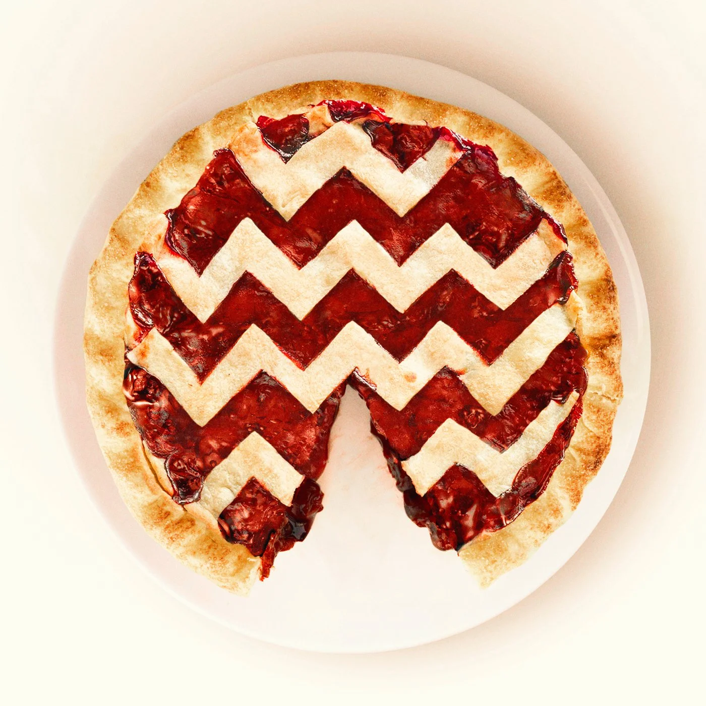
Lynch’s visual language (the red room, the chevron, the deep Pacific Northwest dark) served as architecture, not decoration.


Title Treatment
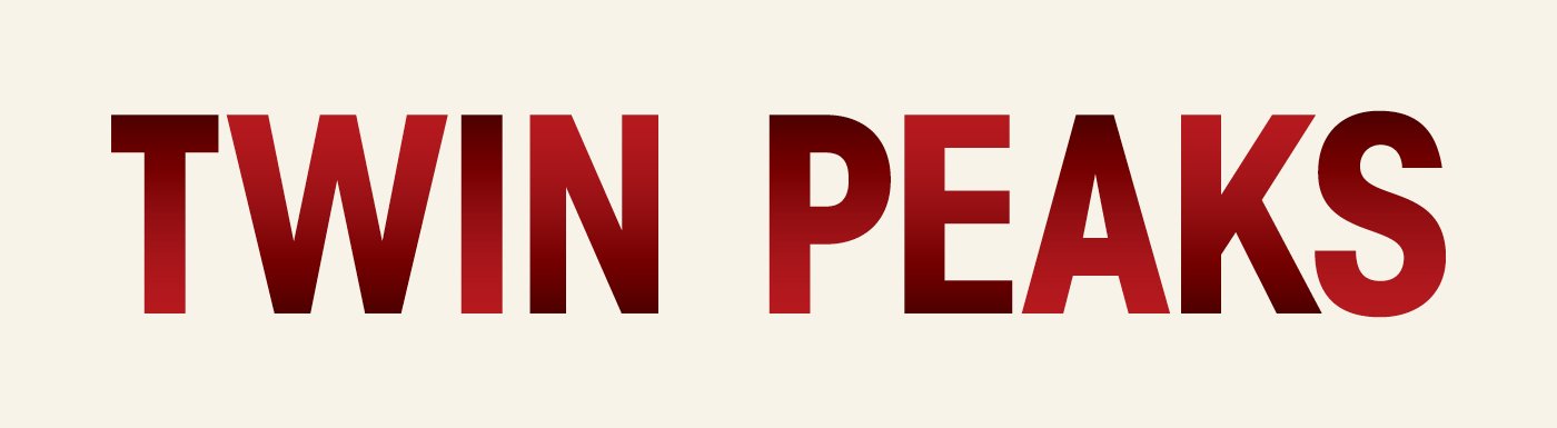
The original Twin Peaks title is one of the most recognizable designs in television. Updating it meant creating something that acknowledged the classic without imitating it. Two treatments were developed, each a different response to the same question.
The solid version retains the weight and presence of the original but shifts the palette entirely. Subtle gradients run in different directions within each letter, giving the type a dimensionality that reads as contemporary rather than nostalgic. It stands on its own.
The outline version echoes the original more directly. Same letterforms, new palette, interior dropped out. The shape is familiar. The fill is gone. A memory of the classic, not a reproduction of it.
Both were designed to work in this century. Not as tributes. As successors.

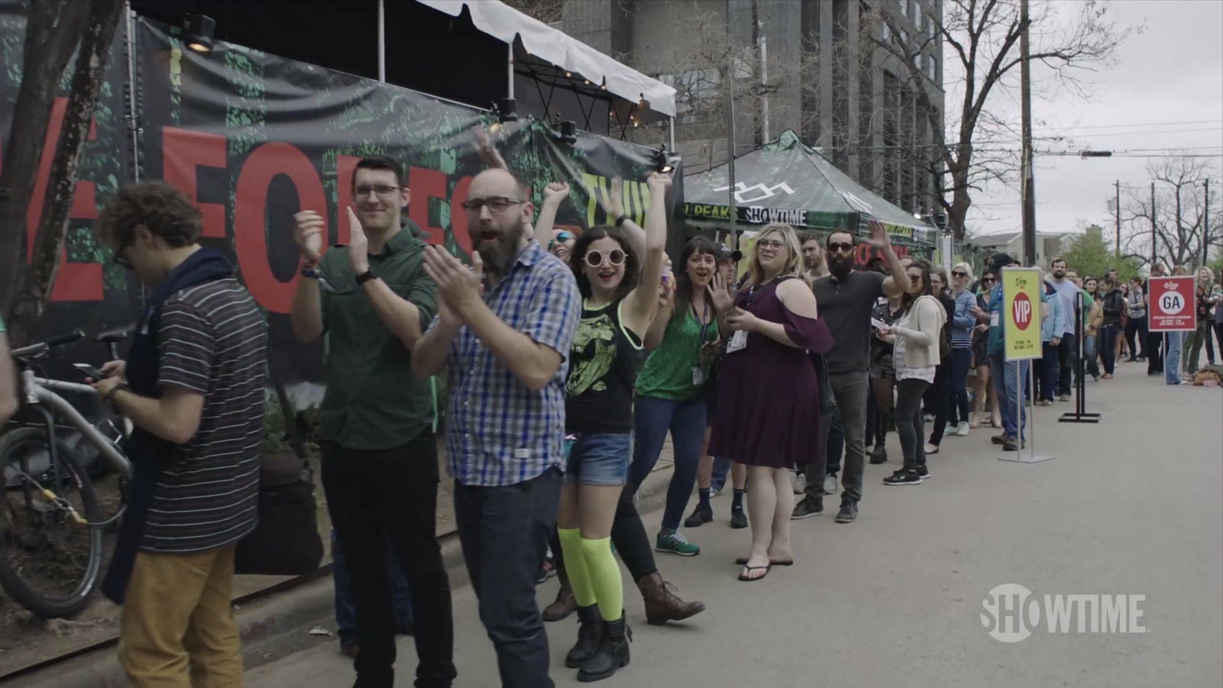
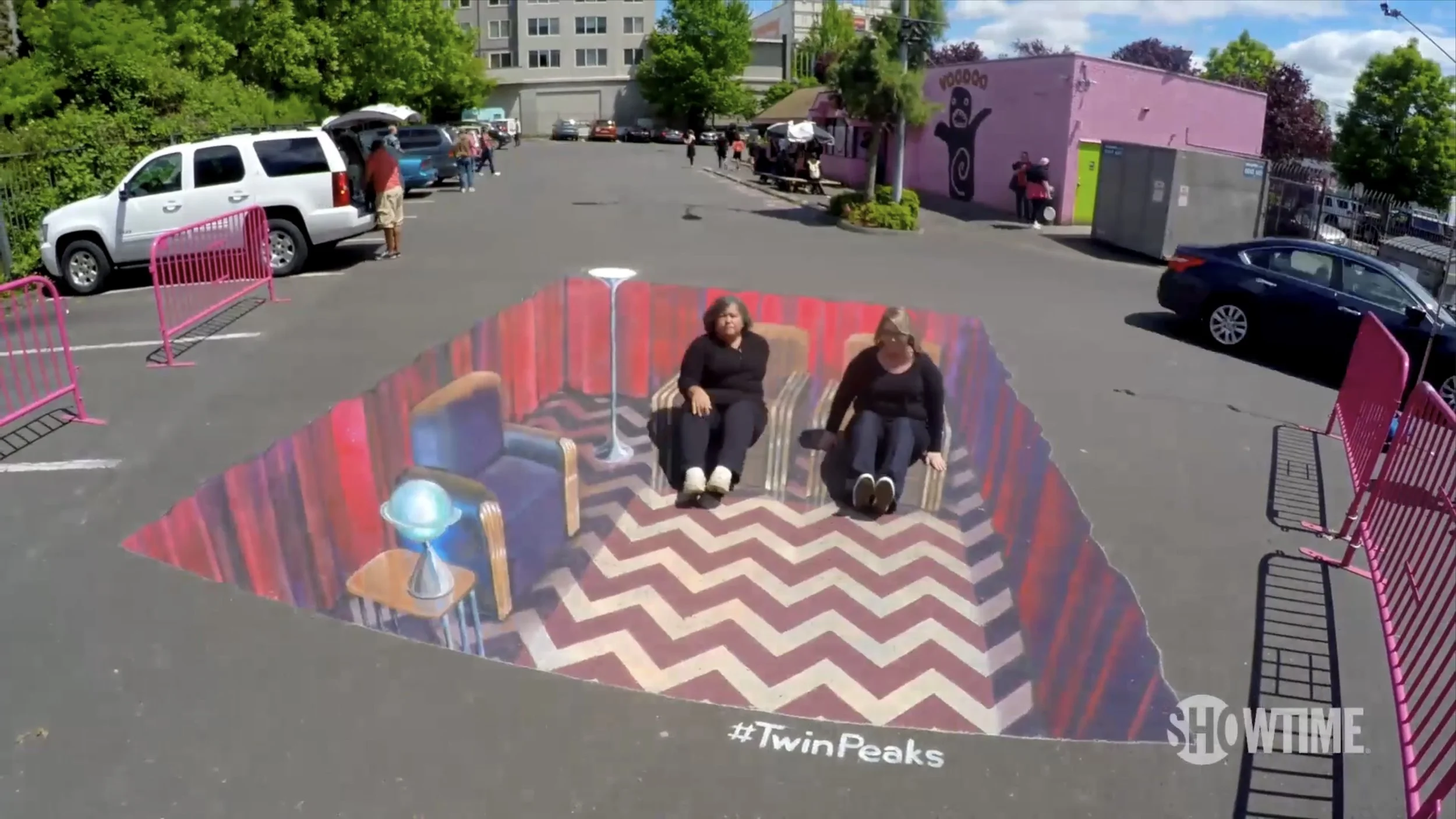
Experiential / Environmental
9,000 visitors over two days. Lines around the block at Clive Bar on Rainey Street. The Double R Diner, the Twin Peaks Lodge, the photo booth, the merch. Every surface a continuation of the campaign creative, built into three dimensions. The creative challenge wasn’t atmosphere for its own sake. It was coherence. Everything a fan touched or stood in front of had to feel like the same world. Kyle MacLachlan is working the crowd outside. Neko Case and Real Estate inside. When the physical space and the campaign creative speak the same visual language, the activation stops feeling like marketing. It starts feeling like the show.