Wondery
Wondery’s audience is as diverse as its catalog. Our creative reflects the rich diversity of stories, hosts, and subjects across the platform. Every solution is carefully crafted to capture the show's essence and signal to listeners what they’re about to experience, maximizing engagement. To achieve this, I fully immerse myself in each show—exploring its themes, learning about the hosts, and capturing the unique tone needed to reach its audience authentically. When the creative shows up in the world, it doesn't just look right—it feels right. The work has driven measurable impact: many of these shows hit number one on podcast charts, often doubling TPE goals, with multiple projects earning industry recognition over the past year—validation that the strategic rigor translates into work that resonates both commercially and critically.
In early 2024, I spearheaded a comprehensive reset of our operations—streamlining systems, strengthening cross-functional alignment, and guiding agency reviews and the RFP process. As Group Creative Director, I oversee a diverse network of agencies, creative directors, art directors, illustrators, editors, and animators, ensuring cohesive execution across all creative touchpoints. At the heart of this transformation is a renewed creative strategy that champions clarity, impact, and visual storytelling designed to hold its ground in crowded feeds—especially at small sizes where attention is hardest to earn.
Throughout 2025, I’ve led the strategic integration of AI-powered workflows across our creative operations—not as a replacement for craft, but as a tool for expanding creative possibility. This transformation has fundamentally changed how we work: prototyping that once took days now happens in hours, enabling rapid iteration and more adventurous creative exploration. AI has unlocked the capacity to test concepts that would have been cost-prohibitive under traditional workflows, allowing us to pursue more ambitious visual directions and refine ideas faster. The result is a more agile operation that maintains creative excellence while dramatically expanding what we can imagine and execute.


Case Study: Lawless Planet
Lawless Planet represents the complete arc of my creative process, from initial brief through final execution. This limited narrative podcast features thoroughly investigated and reported true stories from the intersection of environmental devastation and criminal enterprise—oil company corruption, illegal mining operations, green energy scams, and corporate malfeasance that treated ecological collapse as collateral damage. The show's breadth demanded a visual approach that could capture both its investigative rigor and environmental stakes without defaulting to a single thematic lane. The challenge was finding a solution that could convey this convergence of crime and ecology without resorting to the familiar visual language typically used in environmental storytelling: earnest earth tones, melting ice caps, or overly literal depictions of crisis. The final key art achieves a more nuanced effect. Eiko Ojala's signature layered illustration technique allowed us to literally peel back the surface of the planet, revealing the machinery of greed and extraction underneath—dollar bills floating above scenes of industrial pollution, all rendered in a color palette designed to command attention rather than fade into the background. The bright yellow field and bold navy typography ensure the art holds up at thumbnail scale, where most podcast discovery happens, while the intricate details reward closer inspection. Getting to this solution required building the groundwork carefully: a comprehensive creative brief that secured internal alignment on tone, audience, and strategic intent; thorough vetting of Eiko's portfolio to ensure his distinctive style could serve the content's complexity; and multiple rounds of sketching that explored different conceptual territories before we committed to complete execution. It's the kind of methodical approach that makes room for creative risk-taking, because every decision is rooted in a clear understanding of what the show needs and who we're trying to reach.

The Creative Brief
Each creative brief secures marketing and content alignment first. It then provides the essential blueprint for our external partners, serving as both compass and contract for collaborative creative development. These presentations capture everything from practical timelines and deliverable specifications to the more nuanced elements that determine whether a campaign truly connects, the intended tone, the podcast’s underlying ethos, the specific audience we’re trying to reach, and why they should care. A carefully crafted brief doesn’t just outline what we’re making; it articulates the thinking behind those choices. It establishes a shared language around aesthetic direction, clarifies which creative approaches best serve the content, and ensures that everyone, from illustrators to social media strategists, understands not only the tactical requirements but also the strategic intent behind it. When social-first guidelines appear alongside artist selections and concept explorations, we’re documenting a comprehensive creative ecosystem—one where every decision is rooted in a clear understanding of what the story needs and who we’re inviting to listen. It’s the difference between handing someone a list of tasks and bringing them into a conversation that’s already in motion, one where they can make meaningful contributions because they understand where we’re going and why.

Round 1 — Sketches
We took our time exploring a range of solutions in sketch form before committing to any comping or color work—an investment that proved essential to the project's success. Working with Eiko, whose distinctive style and execution brought something fresh and unexpected to the podcast space, we developed fourteen sketches that covered substantial creative ground, including variations on the strongest concepts. Some lean into metaphors of imprisonment and culpability, others explore the visceral impact of pollution and extraction, while still others use layered cutaways to reveal the human stories hidden within ecological devastation. Presenting this breadth early accomplished two critical things. First, it gave our internal stakeholders meaningful agency in the creative direction, transforming what could have been a passive approval process into genuine collaboration. When senior leadership can see the range of possibilities and understand the strategic thinking behind each approach, they become invested partners rather than distant gatekeepers. Second, it protected us from the expensive misstep of developing the wrong concept too far. By keeping everything at the sketch stage—focused on idea rather than execution—we created space for honest conversation about which direction best served the podcast's ambitions. The result was a clear consensus and enthusiastic support that carried us confidently into the more resource-intensive rounds ahead, where we could refine and polish, knowing we were building on solid conceptual ground.

Round 2 — Color
While our illustrator developed the look and feel of the art, we used AI to prototype color schemes for internal review—a strategic choice rooted in understanding that color is the secret weapon in our visual storytelling. Our final palette was designed to achieve two critical goals, grounded in the understanding that bright colors—particularly orange—resonate powerfully with consumers. First, we deliberately moved Lawless Planet away from the traditional ecological tropes one might expect—the earth tones, pastel blues, and gentle greens that typically signal environmental storytelling. This distinction matters because the show encompasses far more than a simple story of ecological decline; it's a complex narrative that deserved a visual language equally bold and unexpected. Second, we needed our art to command attention when viewed alongside competitor shows in the same genre on streaming platforms, where standing out in a crowded thumbnail grid can make the difference between discovery and obscurity. Every piece of artwork was also rigorously checked for ADA accessibility, ensuring our visual choices invite everyone into the story.

Times Square Placement

Case Study: Reclaiming
Reclaiming is an interview-based podcast where Lewinsky explores the idea of “reclamation”—the act of taking back something lost, stolen, or silenced—through intimate, empathetic conversations with guests ranging from actors and writers to activists and public figures. Drawing from her own experience of reclaiming her narrative after years of public scrutiny, Lewinsky creates a safe, vulnerable space where people share deeply personal stories about identity, resilience, and transformation. Rather than offering prescriptive advice, the show emphasizes honest dialogue and human connection, with each episode ending by asking guests what they are still striving to reclaim.
We worked closely with Monica from the earliest stages of pre-production straight through to the podcast’s release and beyond to establish her as a warm, approachable presence.
Upon release, Reclaiming more than doubled its total plays and engagement goal.

Our Collaborative Brief
Before we stepped into the studio, we built a comprehensive pre-shoot deck that functioned as both a strategic alignment tool and a creative roadmap. This document did the essential work of bringing everyone—Monica, the photographer Zoey Grossman, stylists, and our internal team—into the same conversation about who Monica is today and how we wanted to capture that evolution. The deck walks through existing photography to establish context, presents a carefully considered color palette drawn from her apartment's aesthetic, profiles our photographer and creative team, and explores multiple shoot concepts, ranging from candid behind-the-scenes moments to tightly cropped portraits to more experimental approaches, such as multiple exposure. It documents everything from wardrobe direction to furniture selection to typography references, ensuring nothing was left to chance or assumption. This level of specificity was crucial because we were making a deliberate departure from the armored, high-contrast imagery that had dominated Monica's recent editorial presence. We wanted soft, natural lighting. Approachable wardrobe. Expressions that invite rather than deflect. The pre-shoot deck became our shared reference point for capturing Monica as the warm, intellectually curious host she’s become—someone confident enough to lower the walls rather than reinforce them. Every creative choice is traced back to this document, which is why the final images feel cohesive and intentional rather than accidental.

The Shoot
While Monica Lewinsky’s recent editorial photography has consistently portrayed her through a lens of strength and armor, emphasizing her resilience and formidable presence, we deliberately chose to reveal a different facet of who she is today. Rather than the steely resolve that has become her visual signature, these images celebrate Monica as the warm, intellectually curious host she’s become. The wardrobe choices—soft neutrals, relaxed button-downs, and earth-toned knits—work in harmony with natural lighting to create an immediate sense of approachability and invitation, rather than distance. You see it in the unguarded moments: genuine laughter, thoughtful expressions, the ease of someone sitting cross-legged or leaning back into a chair without performance or pretense. Even the single black-and-white portrait, which could have veered toward the dramatic aesthetic that's defined her recent press, instead captures introspection rather than defense. These images document her accessibility and authentic presence, showing someone who has transformed not just her public narrative but has grown into a role where she invites others in rather than keeping the world at bay. It’s a portrait of evolution: from someone who had to build walls to someone confident enough to tear them down.

Social Clips
Just as we chose to reveal Monica's approachable, authentic side in our photography, her social content strategy mirrors this same philosophy of genuine connection. TikTok users are notoriously resistant to heavy-handed marketing—younger audiences can immediately detect and reject overly produced, corporate messaging. In keeping with presenting Monica as the thoughtful, accessible host she truly is, we maintained the simplicity and directness that resonates with these platforms. Her advice remains unfiltered and straightforward, supported by minimal graphics and restrained typography that never compete with her authentic voice. The result feels conversational rather than promotional, allowing her natural warmth and intellectual curiosity to shine through without the barrier of over-polished presentation. It's content that invites engagement rather than demanding attention—perfectly aligned with both her evolved public persona and the authentic communication style that younger audiences value.
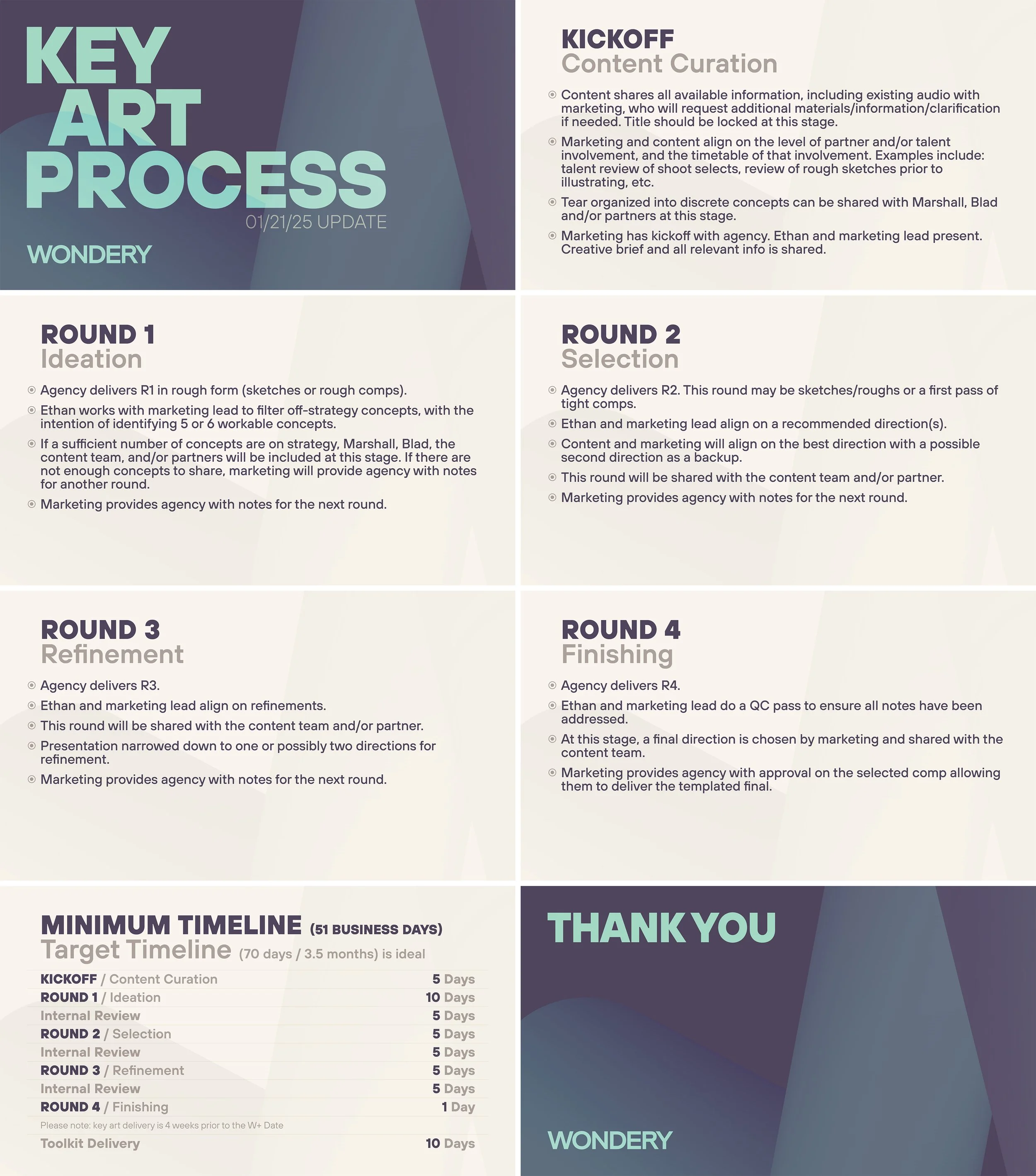
Transforming Wondery’s Key Art Process
When I joined Wondery, the creative development process had evolved organically rather than strategically—timelines were unpredictable, costs varied wildly project to project, and there was no shared understanding of who needed to weigh in at which stage. One of my first priorities was overhauling this system entirely. I conducted stakeholder interviews across content, marketing, and production teams to understand where the friction points lived, then built a standardized framework from the ground up. The result was a cross-functional workflow that formalized every stage of creative development—from initial kickoff and content curation through iterative rounds of ideation, selection, refinement, and finishing—with clear timelines, defined review periods, and explicit decision-making authority at each gate. This wasn't about adding bureaucracy; it was about creating predictability. By implementing this approach, we shortened development cycles, made delivery schedules reliable enough to plan campaign launches around, and significantly reduced costs by eliminating the expensive late-stage revisions that came from unclear expectations. Below is the live process deck I distributed across teams and updated quarterly as we refined the system based on what we learned.