The Man Who Fell To Earth
Showtime's The Man Who Fell To Earth is a story about basic human needs and emotions wrapped in science fiction. The creative had to honor that, which meant avoiding every conventional sci-fi trope and sidestepping comparisons to Nicolas Roeg's 1976 film entirely.
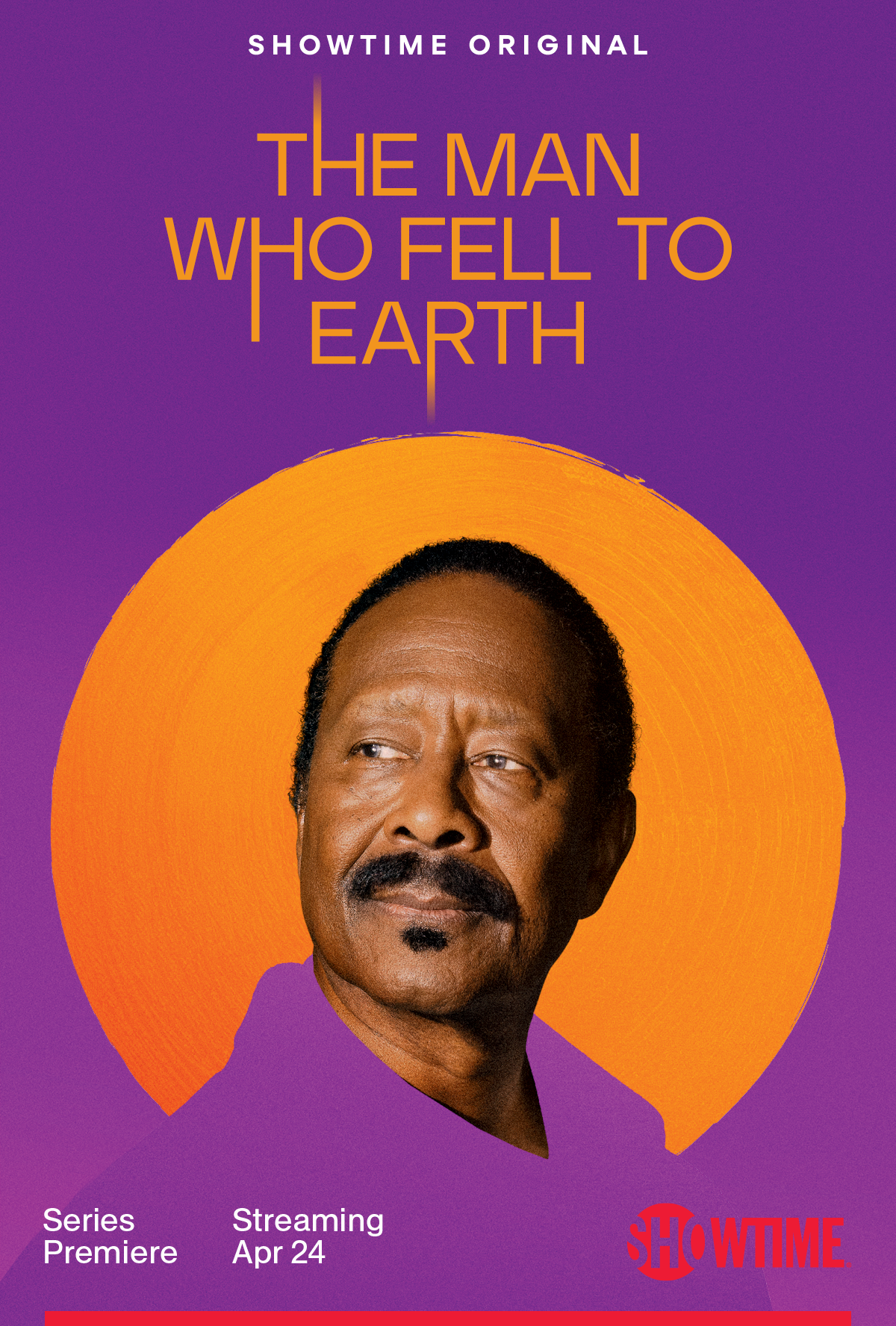
Traditional sci-fi marketing treats characters as part of the environment. Figures dwarfed by landscapes, silhouetted against spacecraft, embedded in world-building tableaux. This show demanded the opposite. Characters occupy the canvas fully. No background competing for attention. No spectacle overshadowing the human story.
Afro-futurism became the conceptual anchor—a framework that gave the marketing a distinctive composition and visual language while subtly honoring the casting of prominent BIPOC actors in lead roles. Not a surface reference. A genuine design philosophy that shaped everything from key art to packaging to digital OOH.
The campaign spanned strategy, conceptual curation, key art, digital tactics, print, and packaging — a cohesive visual language built across every stage of creative development.
“Falling Man” Teaser
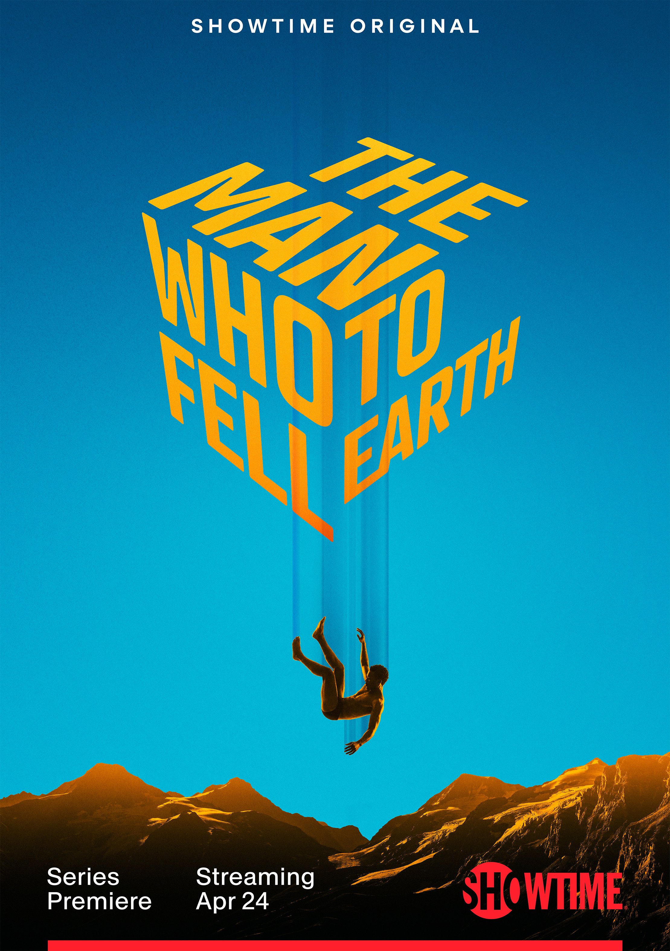
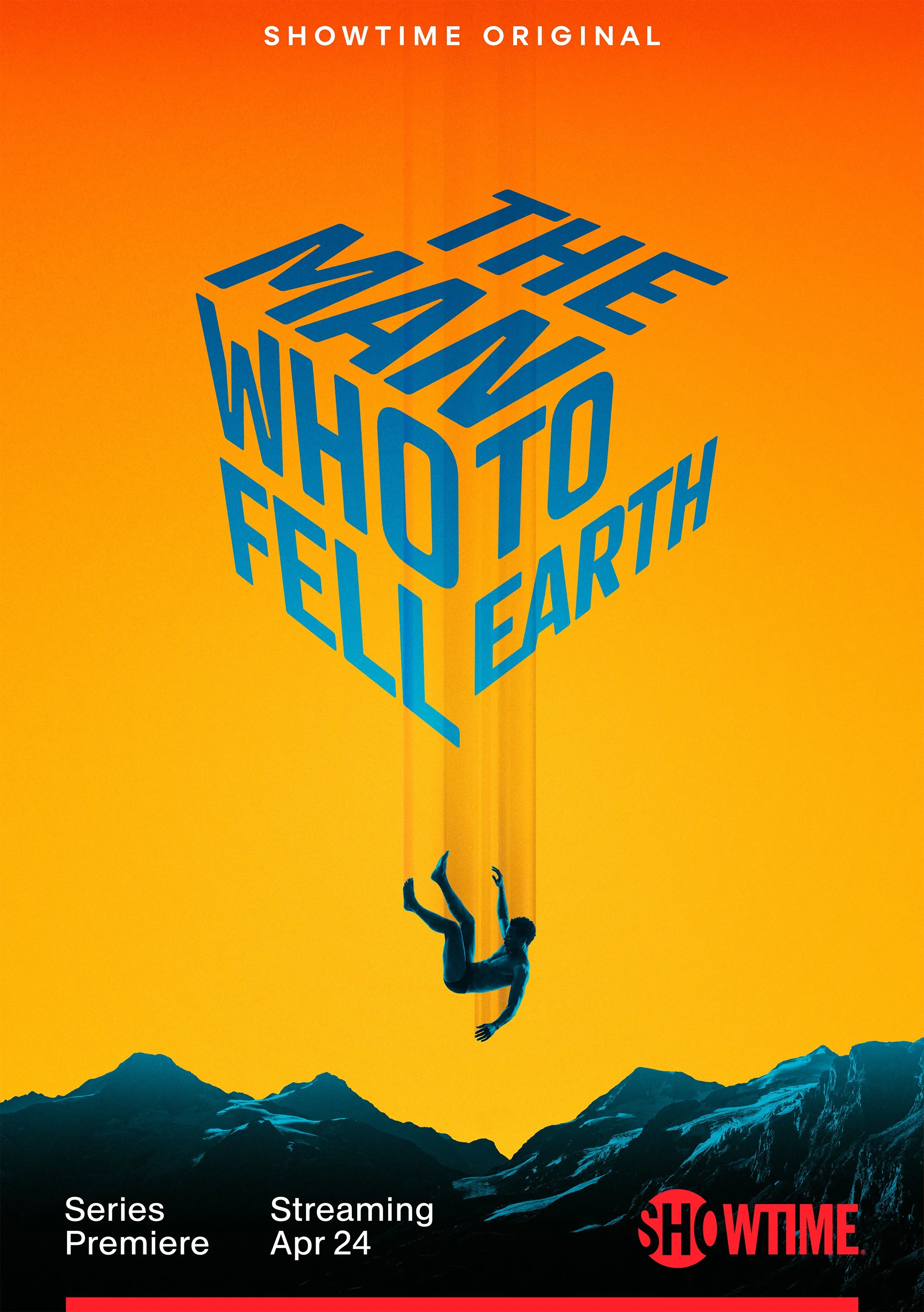
Cube Logo
This logo was created as a free-standing Easter egg that could be animated for A/V and digital OOH.

Character Leads


Character Extensions


Boldsite Installation
Digital OOH
Packaging


Trailers

