Touchstone Health
Touchstone Health Partnership is a Medicare HMO. A highly regulated environment where every patient communication, every piece of collateral, and every brand touchpoint operates under Centers for Medicare & Medicaid Services compliance requirements. The brand had to work within those constraints without feeling constrained.
Healthcare brands speak to everyone at once. Patients. Specialists. Staff across multiple facilities. Each needs something different. All of it has to feel like the same organization.
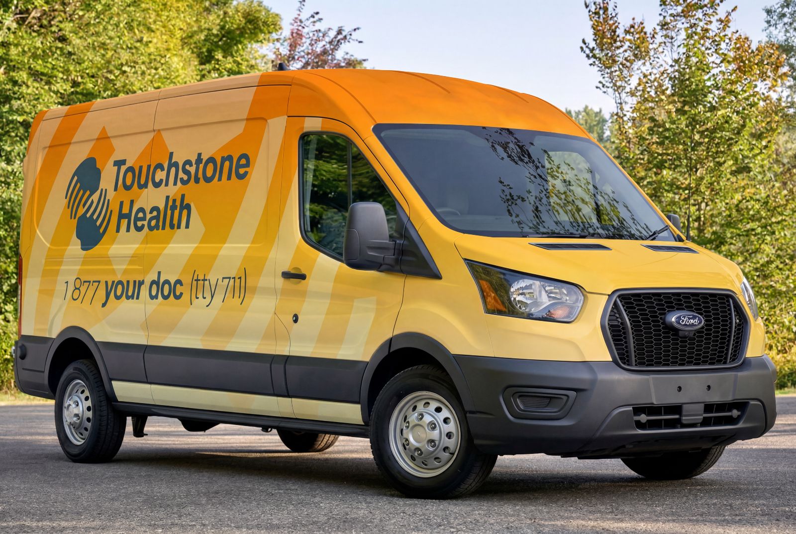
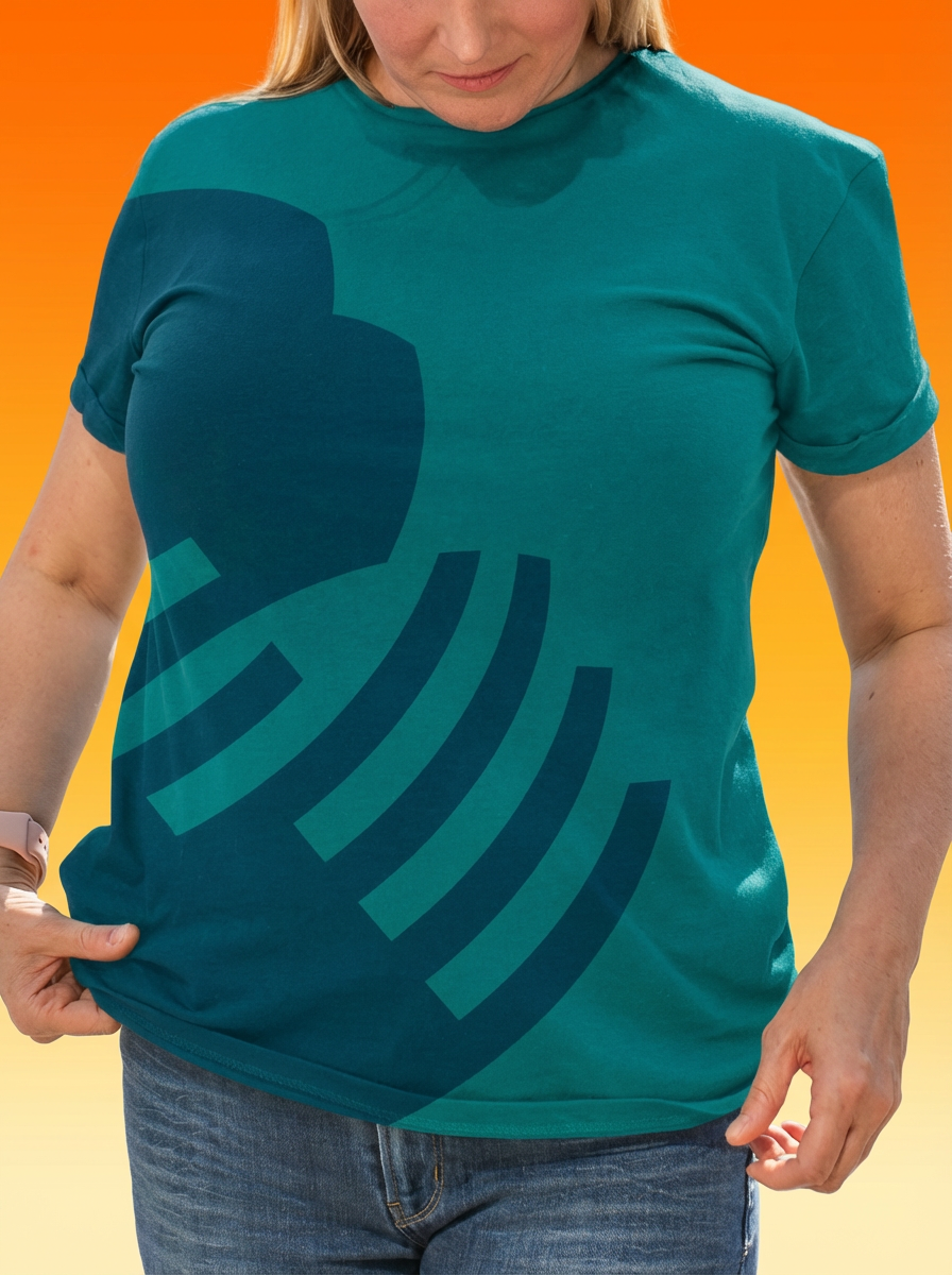
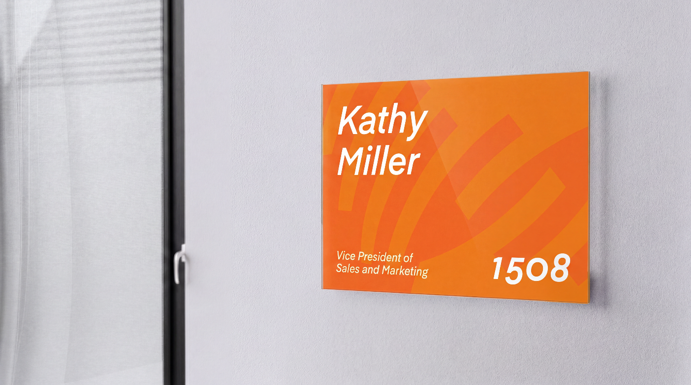
The brand had to work everywhere. Patient materials. Wayfinding signs. Internal communications. Staff t-shirts. Professional without being intimidating. Approachable without losing credibility. Flexible without fracturing.
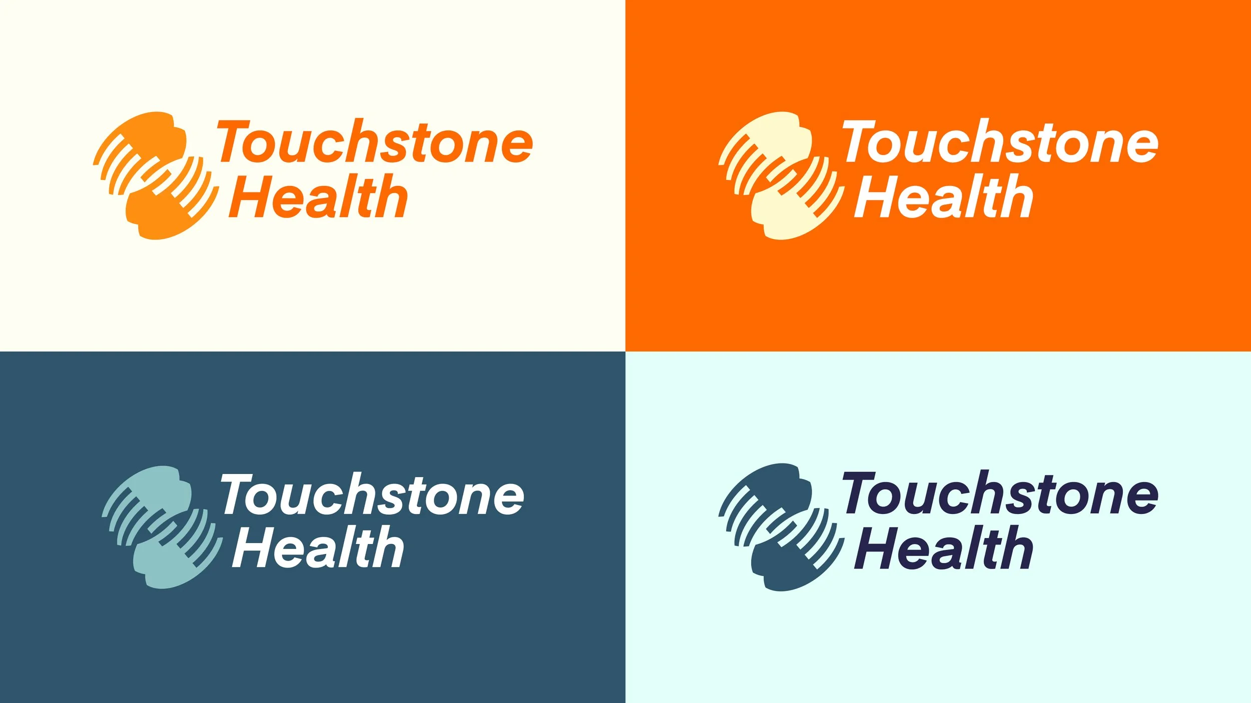
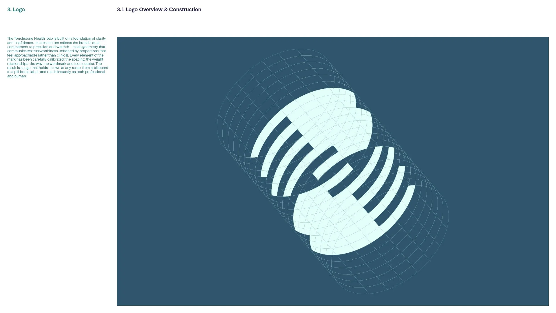
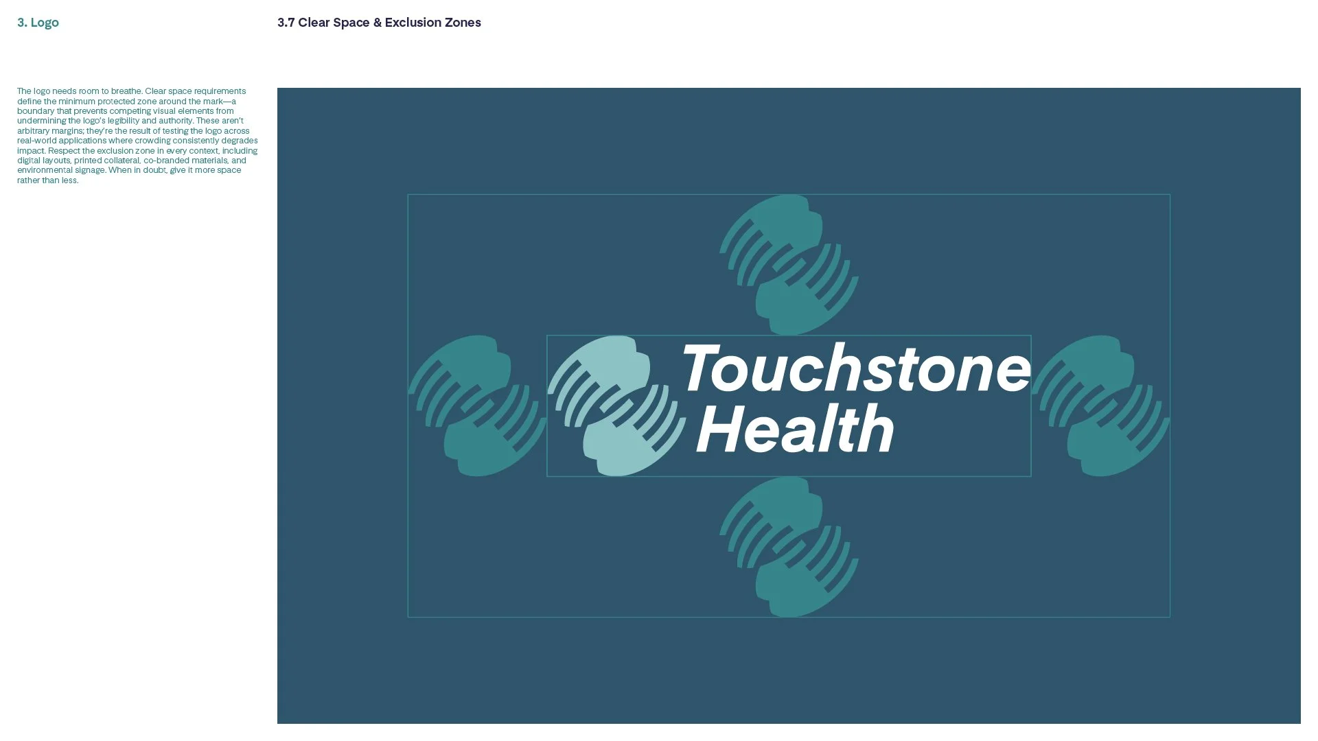
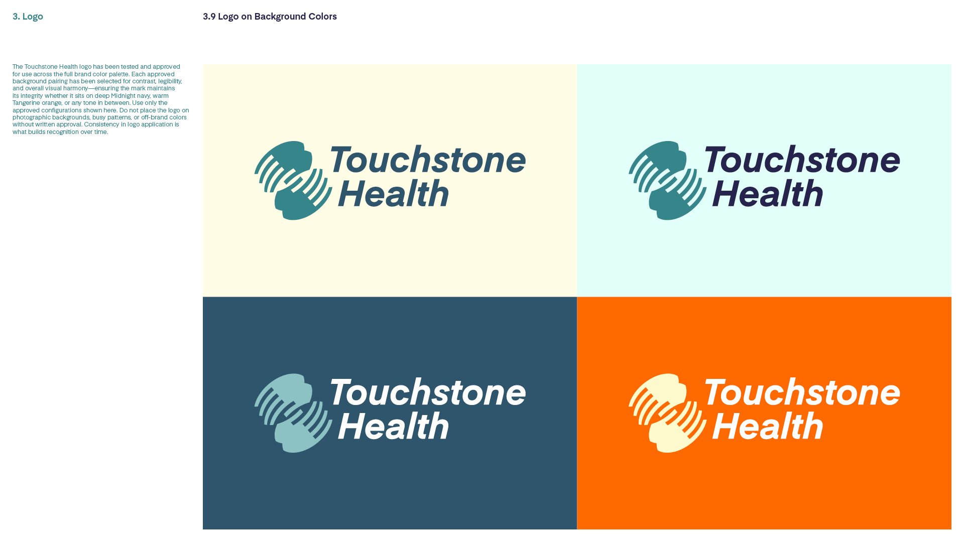
The name provided the starting point for the identity. A touchstone is a test of authenticity, something you touch to reveal what’s genuine. The logo translates that etymology into two hands. Not a metaphor for care in the abstract. A direct visual expression of the word itself: human contact as the standard by which everything is measured.
Every section of work that follows was produced under CMS compliance requirements. Trustworthy and human. Consistent but adaptable. Compliant without compromise.


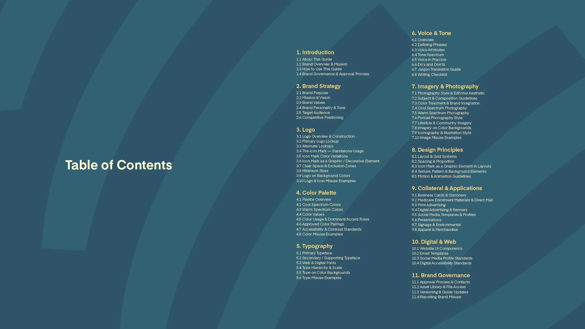
Touchstone Health Style Guide
Healthcare brands face a specific tension: speak to everyone, stay coherent. Touchstone Health needed a system that could adapt across regions, specialties, and contexts without losing itself.
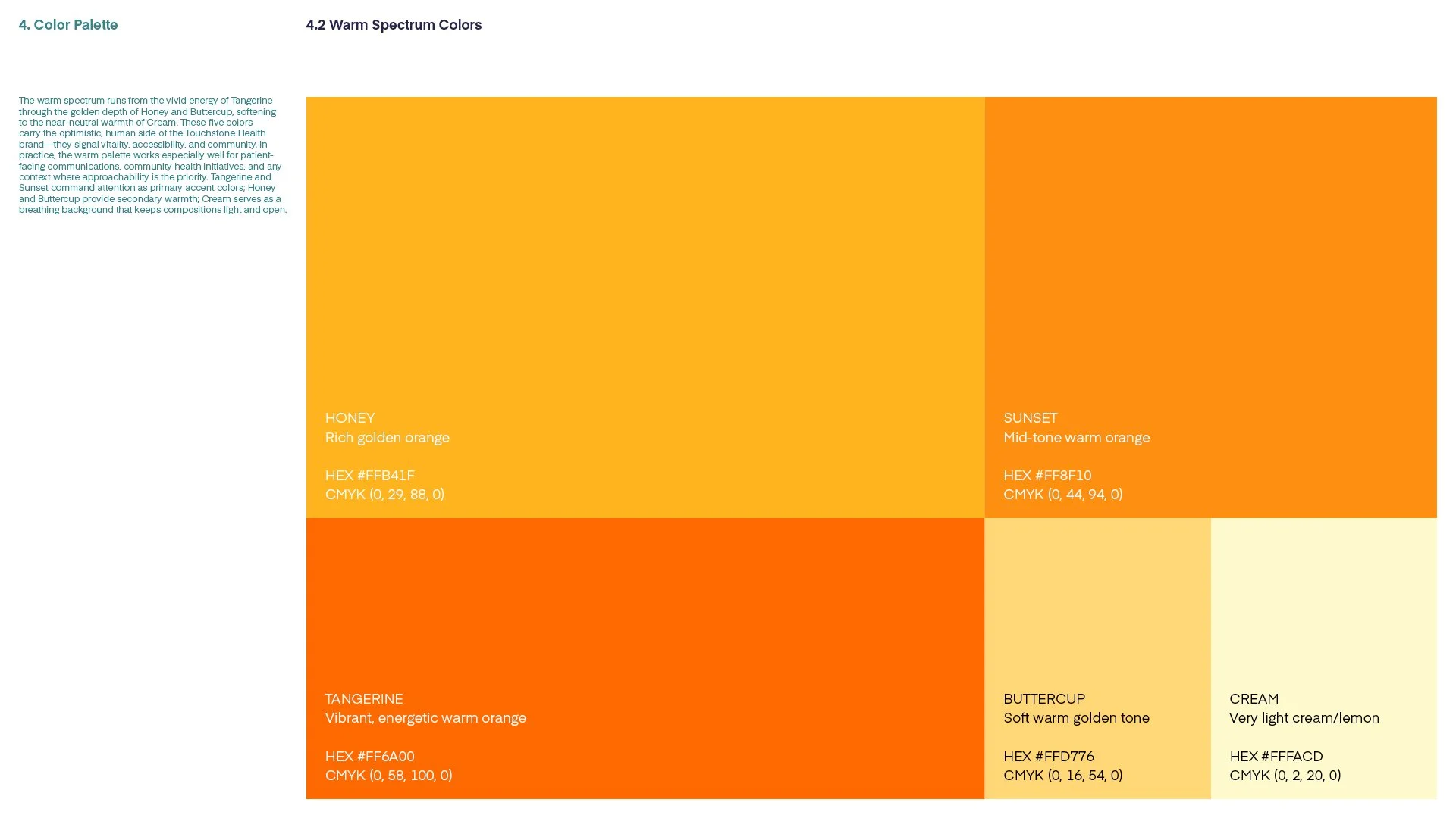
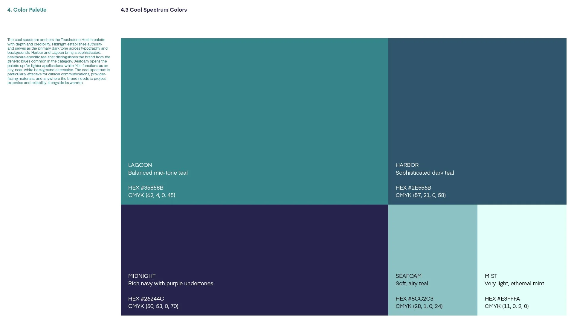
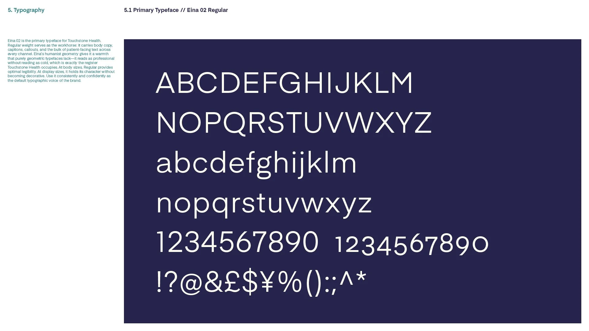
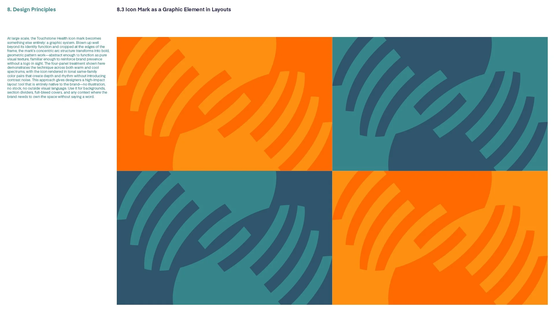
Four elements, working in concert. Eina, a humanist sans-serif typeface: clear, warm, more approachable than the corporate defaults. A ten-color palette split into Warm and Cool Spectrums, color-coded by purpose but unmistakably the same family. The two-hands icon, designed to function as both a logo and a repeating pattern, scaling from a badge to a vehicle wrap to an allover textile. And a brand voice built on four attributes (direct, reassuring, empowering, human) that governs every piece of written communication.
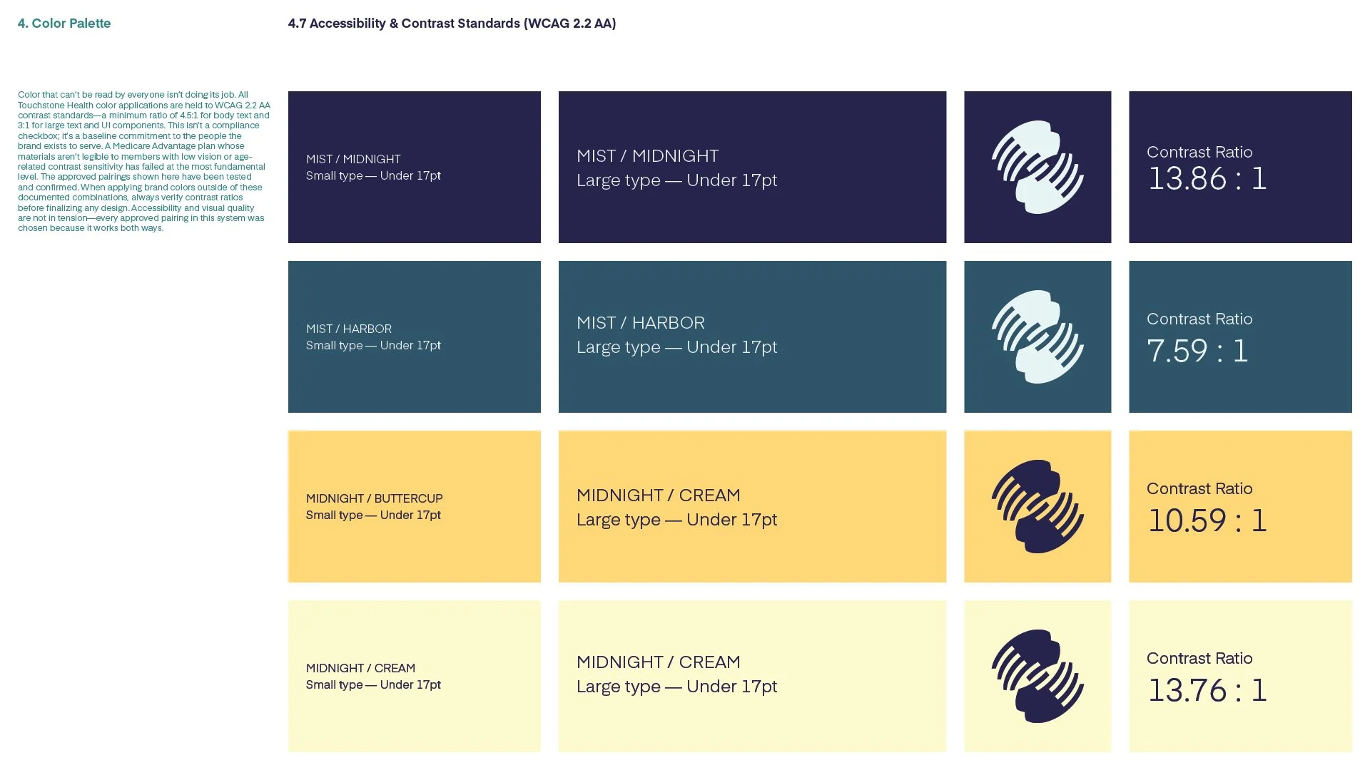
Every element (color, type, photography, language) is calibrated to make patients feel safe, respected, and informed. The system is built for governance: multiple departments, multiple regions, multiple audiences, all operating within the same identity without central approval on every piece. That’s not a design choice. It’s a brand commitment.

AI-Generated Photography
Stock photography has a diversity problem. Finding images that authentically represent a specific community (the right people, the right context, the right feeling) means searching through catalogues built on the same narrow defaults. Custom shoots solve it. The costs make them impractical.
The answer wasn’t simply switching to AI. Generative tools, left unchecked, inherit the same biases as the libraries they replace. The difference is intention.
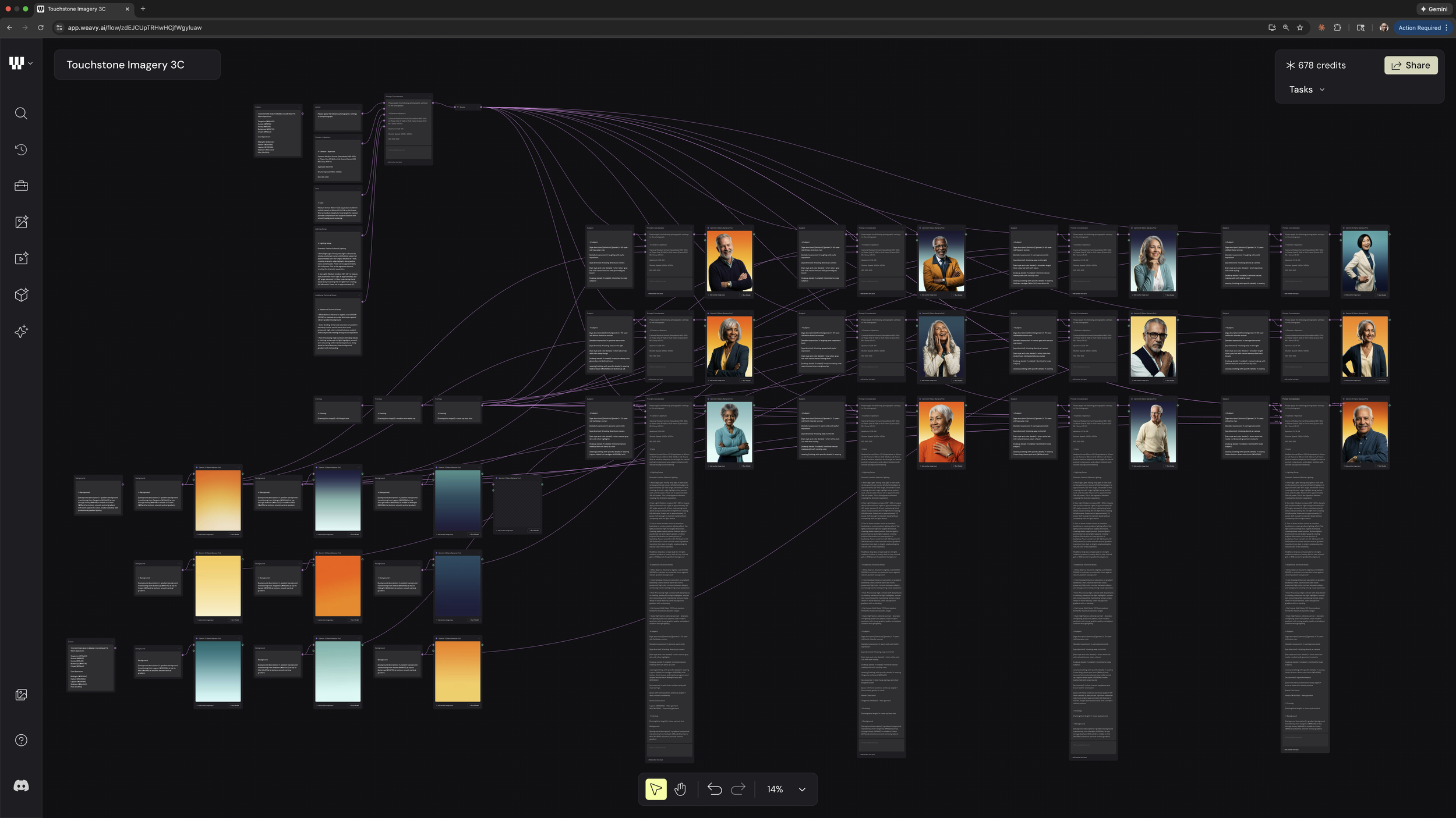
To build the Touchstone Health photography system using Figma Weave and Nano Banana, batches of real photography were analyzed. Each image broken down into its core components: lighting conditions, framing, subject positioning, color temperature, and environment. Those patterns were clustered into templates. The templates were codified into system prompts. The workflow is calibrated specifically to Touchstone Health: their brand colors, their visual standards, and the communities they actually serve.
Not a shortcut. A deliberate tool, built to expand representation rather than recycle its limitations. Creative flexibility that didn’t exist before. Specific moments. Particular communities. Directions tested without the constraints of a stock library or the logistics of a shoot.












Voice + Tone
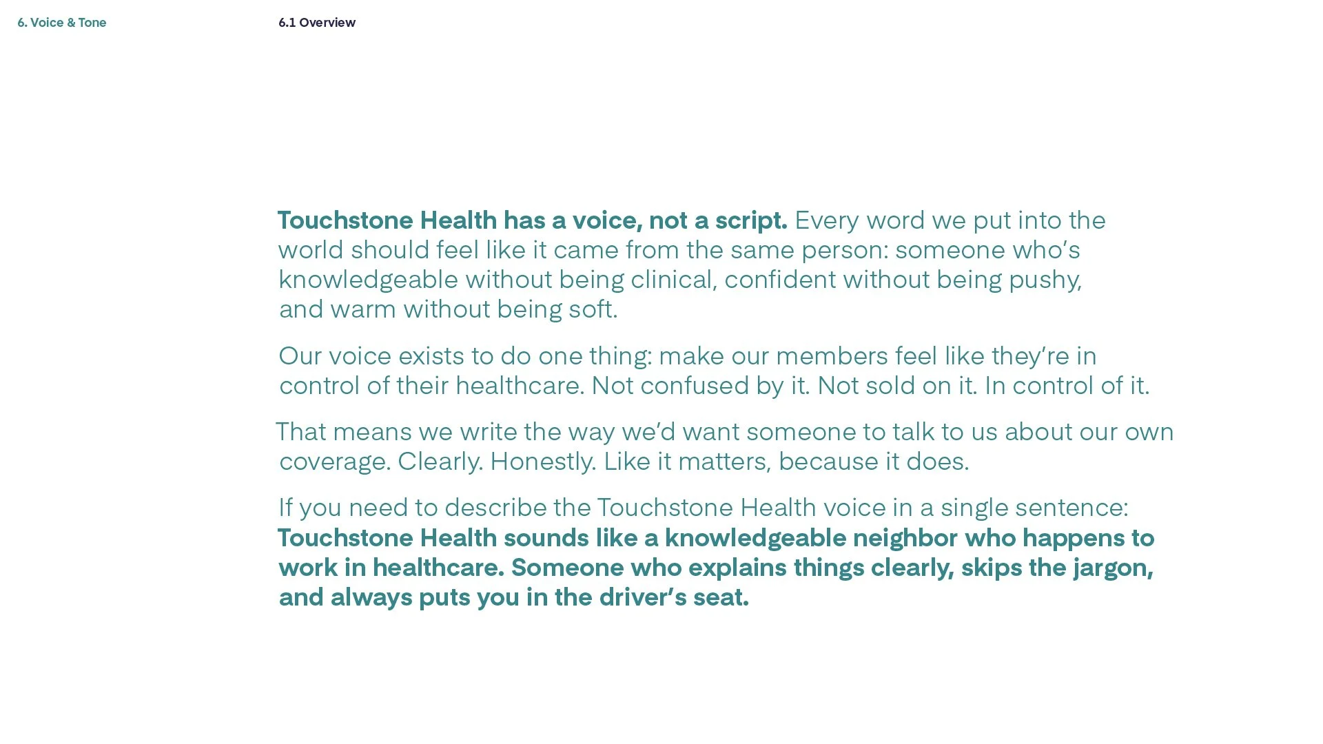
A visual identity without a verbal identity is half a brand. Touchstone Health’s members are making decisions about their healthcare: coverage, providers, costs. The language around those decisions matters as much as the design.
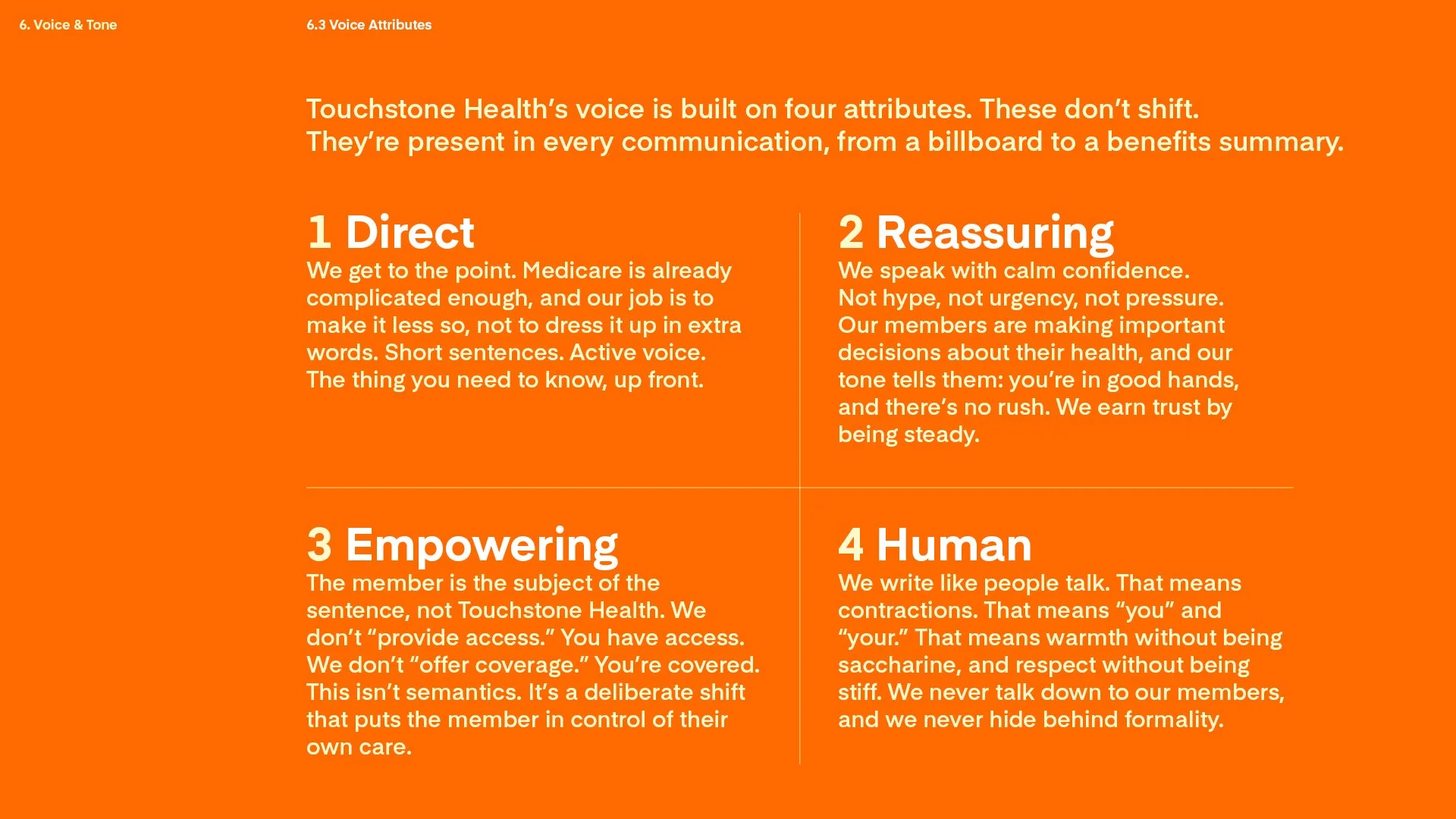
The voice guide was built on a single principle: the member is the subject of the sentence. Not Touchstone Health. Not the plan. The person reading it. “You have access” instead of “We provide access.” “You’re covered” instead of “We offer coverage.”
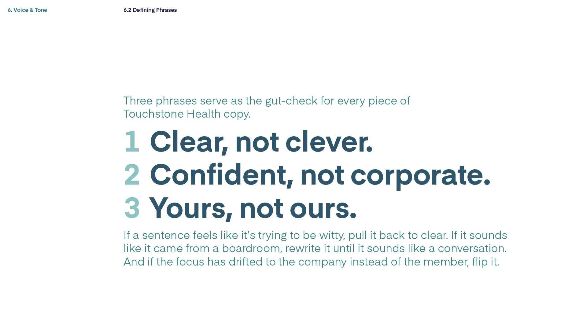
Four attributes anchor the voice across every touchpoint: direct, reassuring, empowering, human. The tone adjusts by context. An enrollment mailer leads with empowerment. A claims letter leads with reassurance. But the voice never changes. Three gut-check phrases keep it honest: clear, not clever. Confident, not corporate. Yours, not ours.
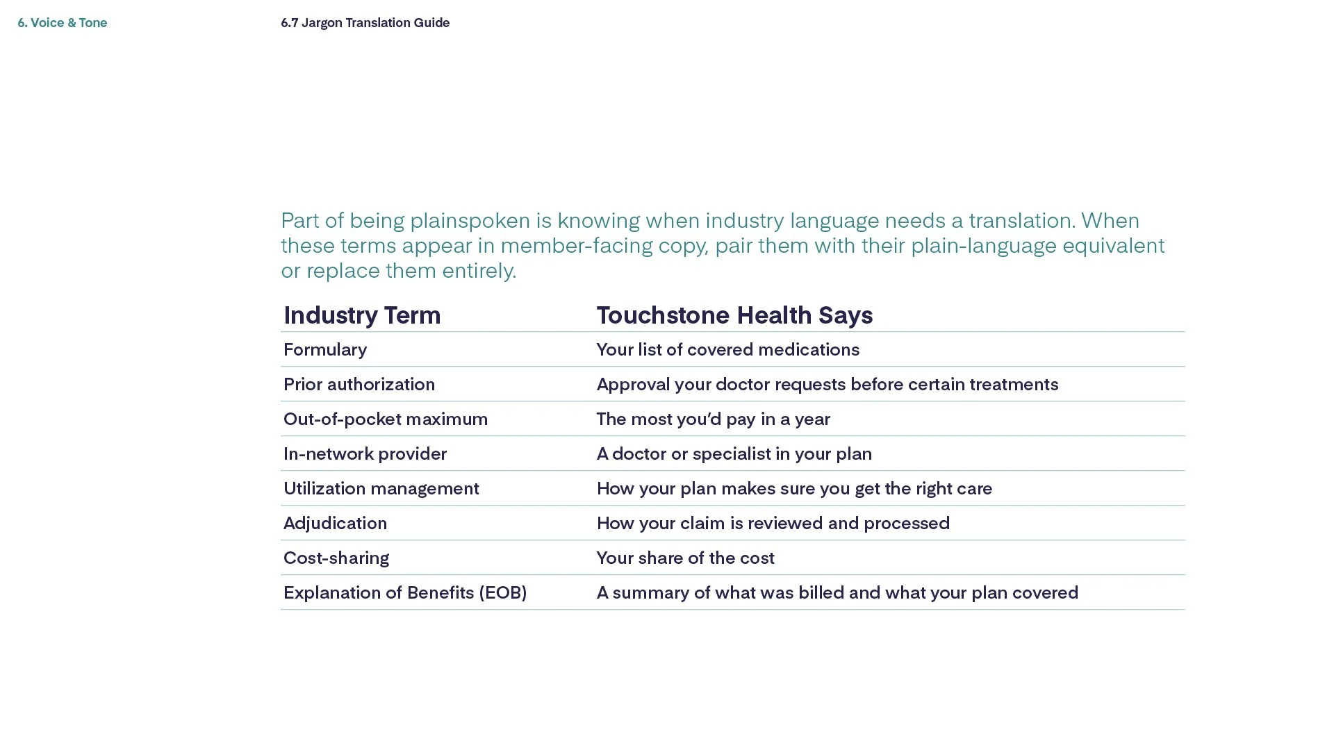
The guide includes a jargon translation table, turning insurance language into plain English. “Formulary” becomes “your list of covered medications.” “Out-of-pocket maximum” becomes “the most you’d pay in a year.” Medicare is already complicated. The brand’s job is to make it less so.
EOCs
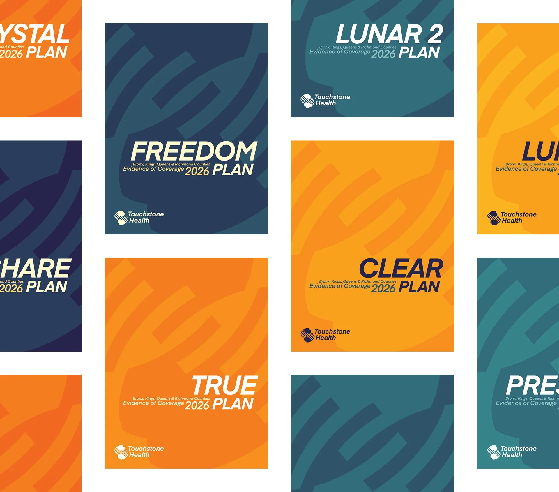
An Evidence of Coverage is a Medicare member’s complete reference for their plan. Every benefit, every limitation, every cost, every rule, laid out in full. The interior is a federally mandated CMS template. Structure, language, and content order are fixed. The cover is where the plan has creative latitude.
Most EOC covers look like legal briefs. Dense. Impersonal. Built for regulators, not readers. The design work here is covers only. Designing at the threshold of a document that cannot be touched.
The Touchstone Health color system made it possible. Ten colors across two spectrums. Enough range to give each EOC its own distinct cover while remaining unmistakably part of the same brand family. For many members, this is the most substantial piece of communication they’ll ever receive from their health plan. It should feel like it was made for them.
Website
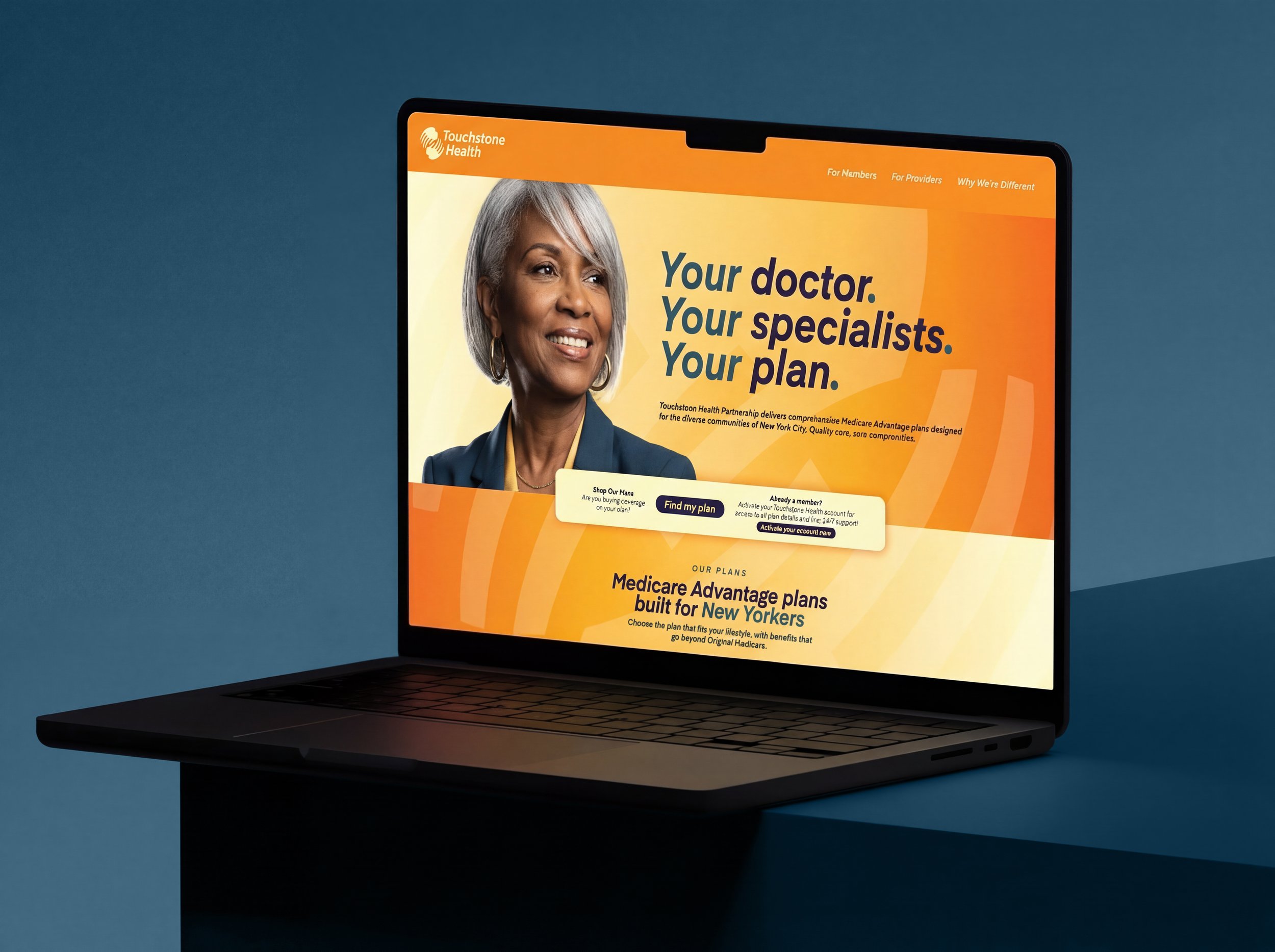
The homepage is where every element of the brand system converges. Color, typography, photography, and voice, working together for the first time in a single environment. The headline follows the voice guide to the letter: the member is the subject. “Your doctor. Your specialists. Your plan.” Three sentences. The member leads. The company follows. The AI-generated photography (built through the same Figma Weave and Nano Banana workflow described above) puts a real face on the brand, not a stock approximation. Navigation is structured around the member’s needs (For Members, For Providers, Why We’re Different) rather than the organization’s departments. The design is warm, confident, and direct. The brand sounds like it reads.
“HERE.” Campaign
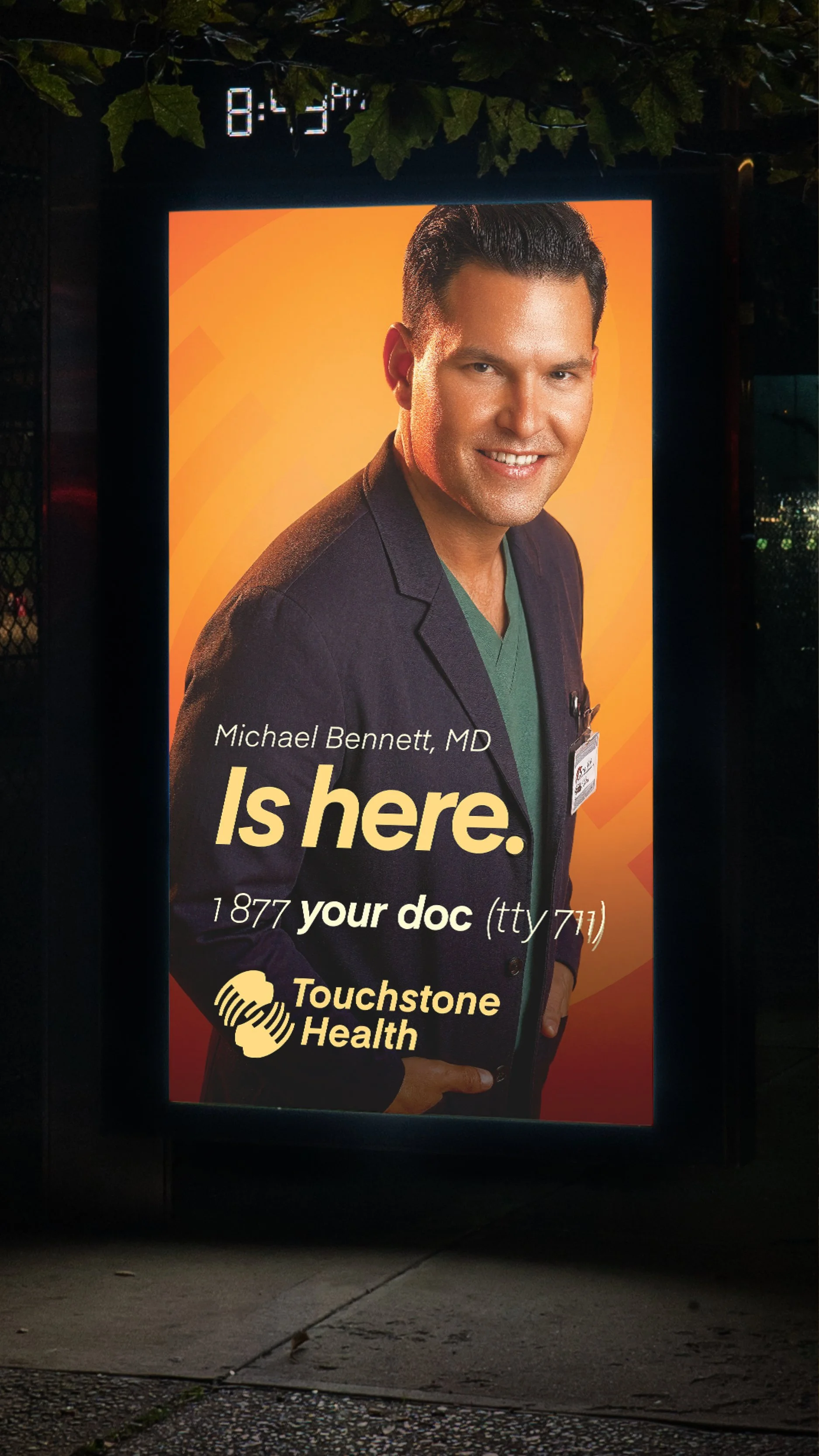
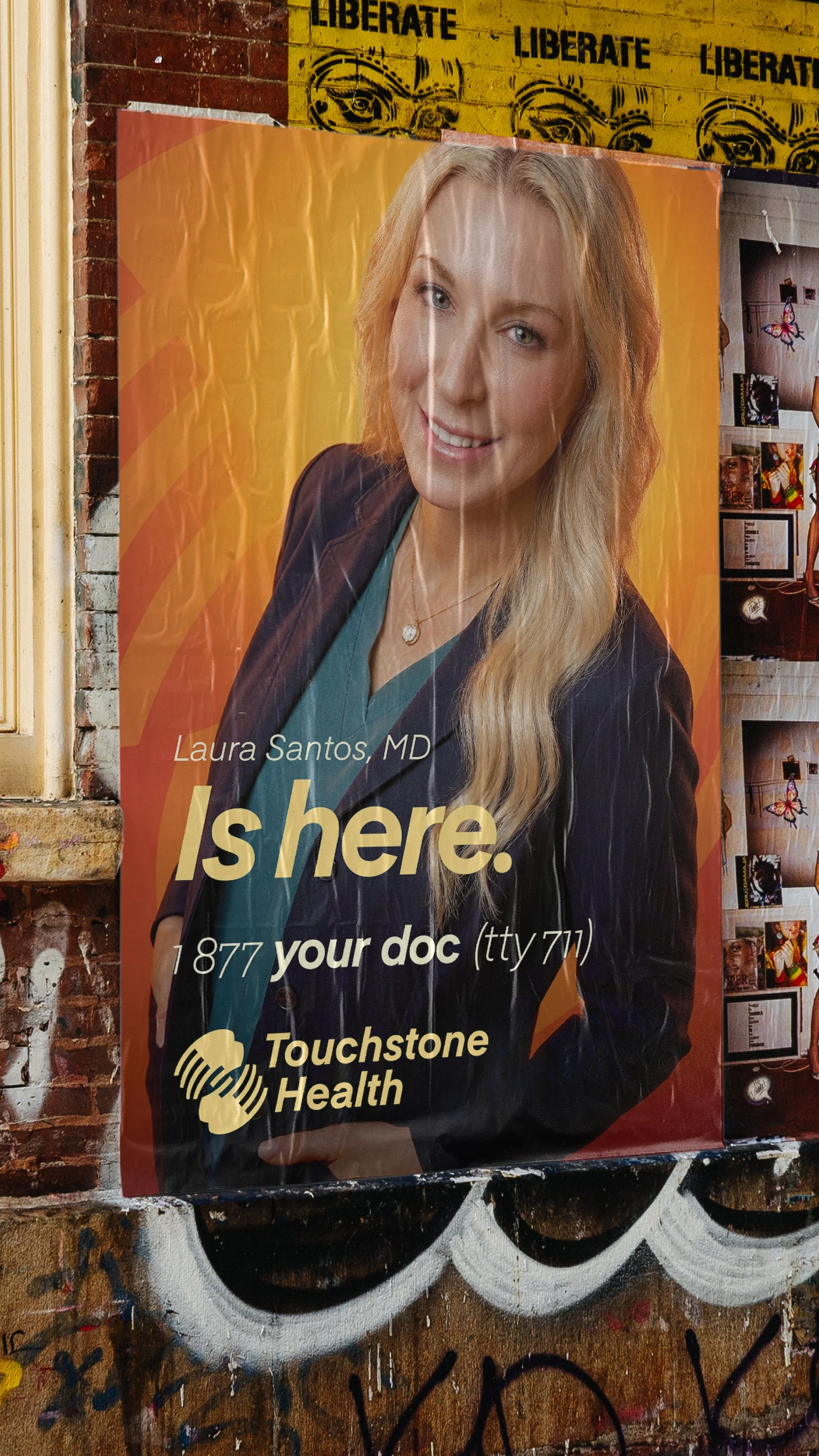
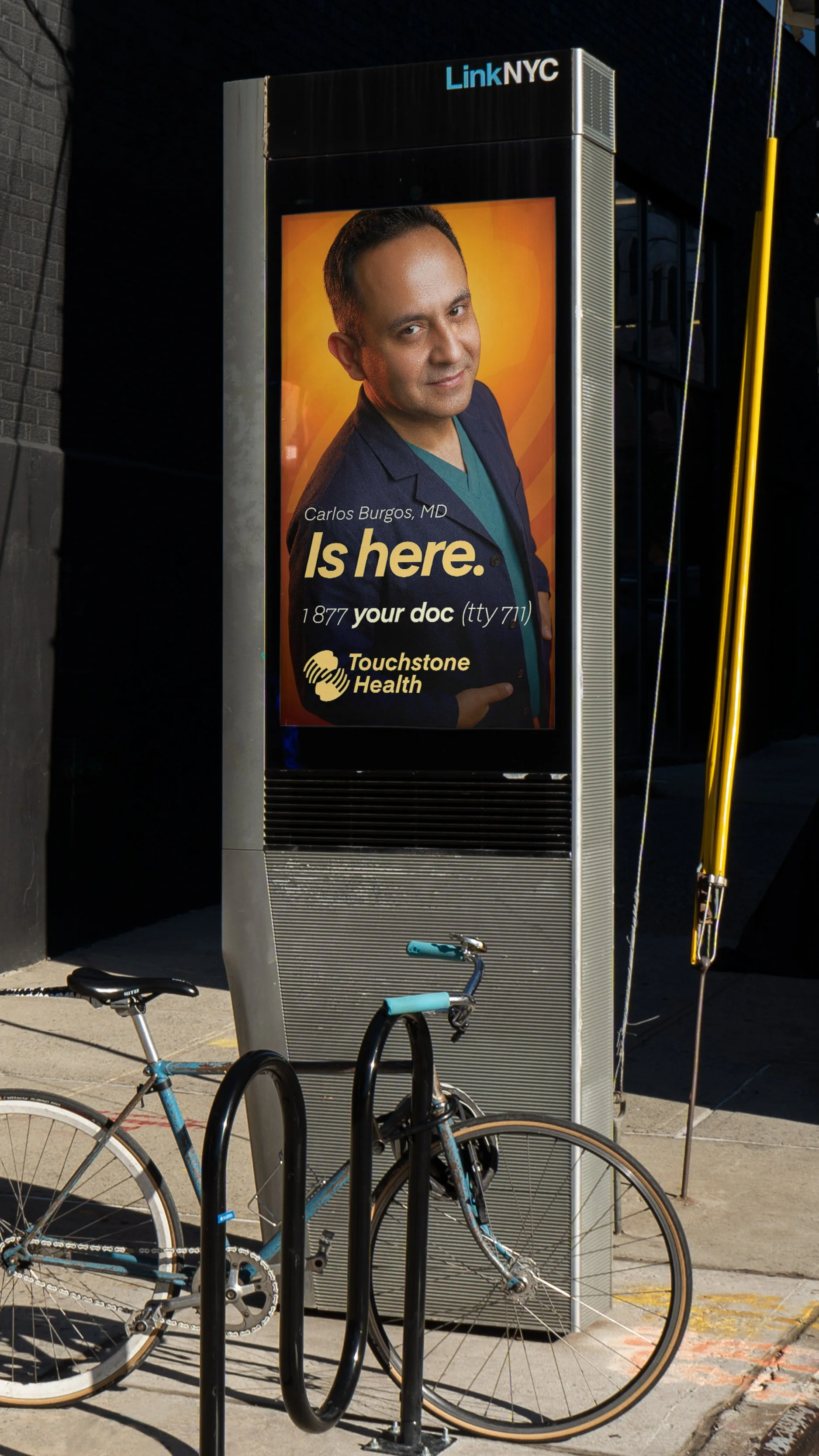
The doctor is the message. Portraits of contracted physicians placed in proximity to their actual offices, facilities, and hospitals. A doctor’s face on the wall outside their building. The brand promise made literal.
The doctor’s name. “Is here.” The vanity number. The logo. No specialty line. No benefit claims. No enrollment language. Pure brand presence.
3C photography against the warm orange gradient. A dark coat over Lagoon scrub top anchors the brand palette in the portrait itself. Bus shelter. Wild posting. LinkNYC kiosk.
Every placement doubles as a co-marketing tool. Touchstone Health’s media dollars support contracted providers, strengthening physician network relationships. The campaign makes the brand visible where care actually happens.
Brand Applications
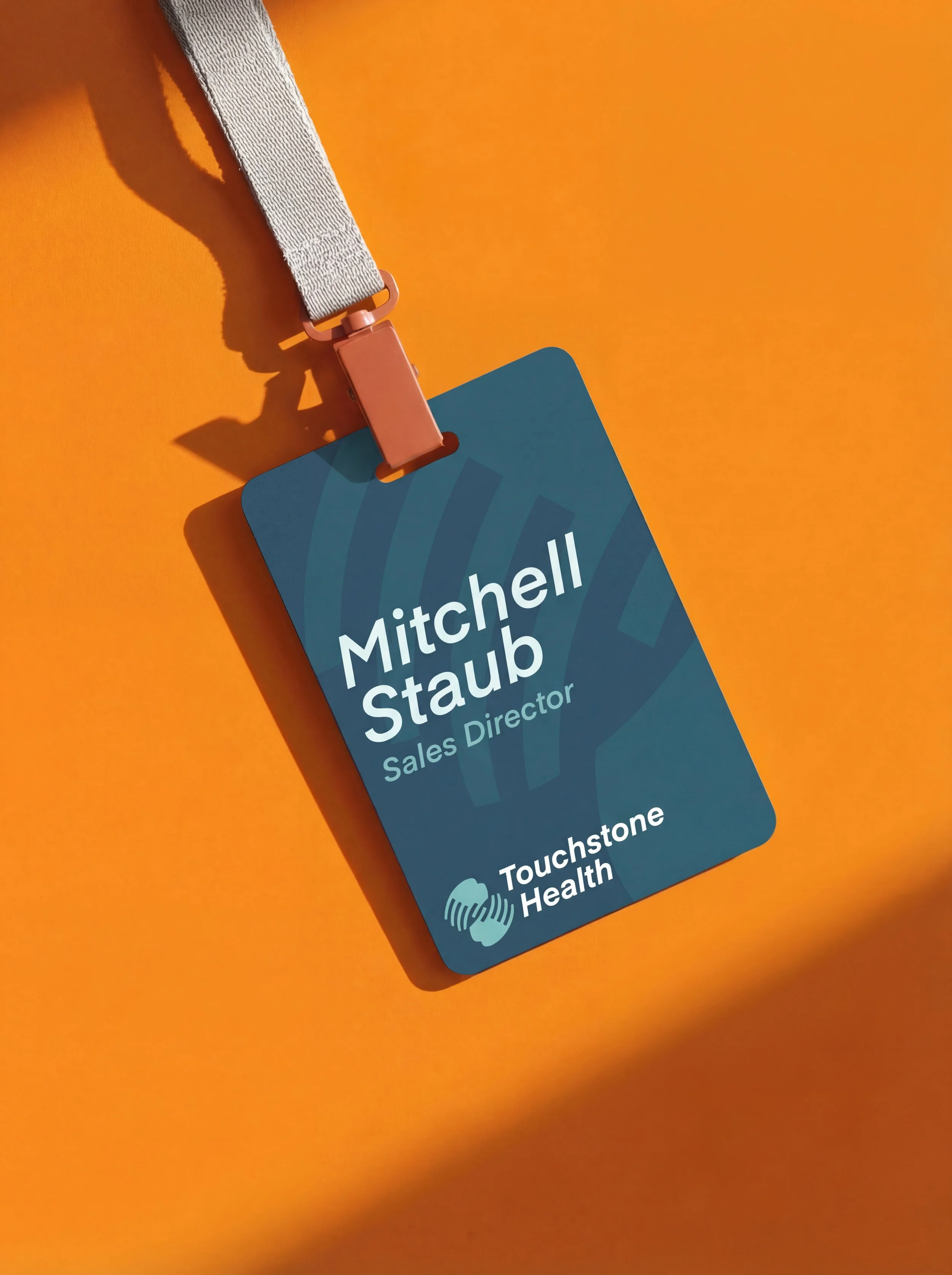
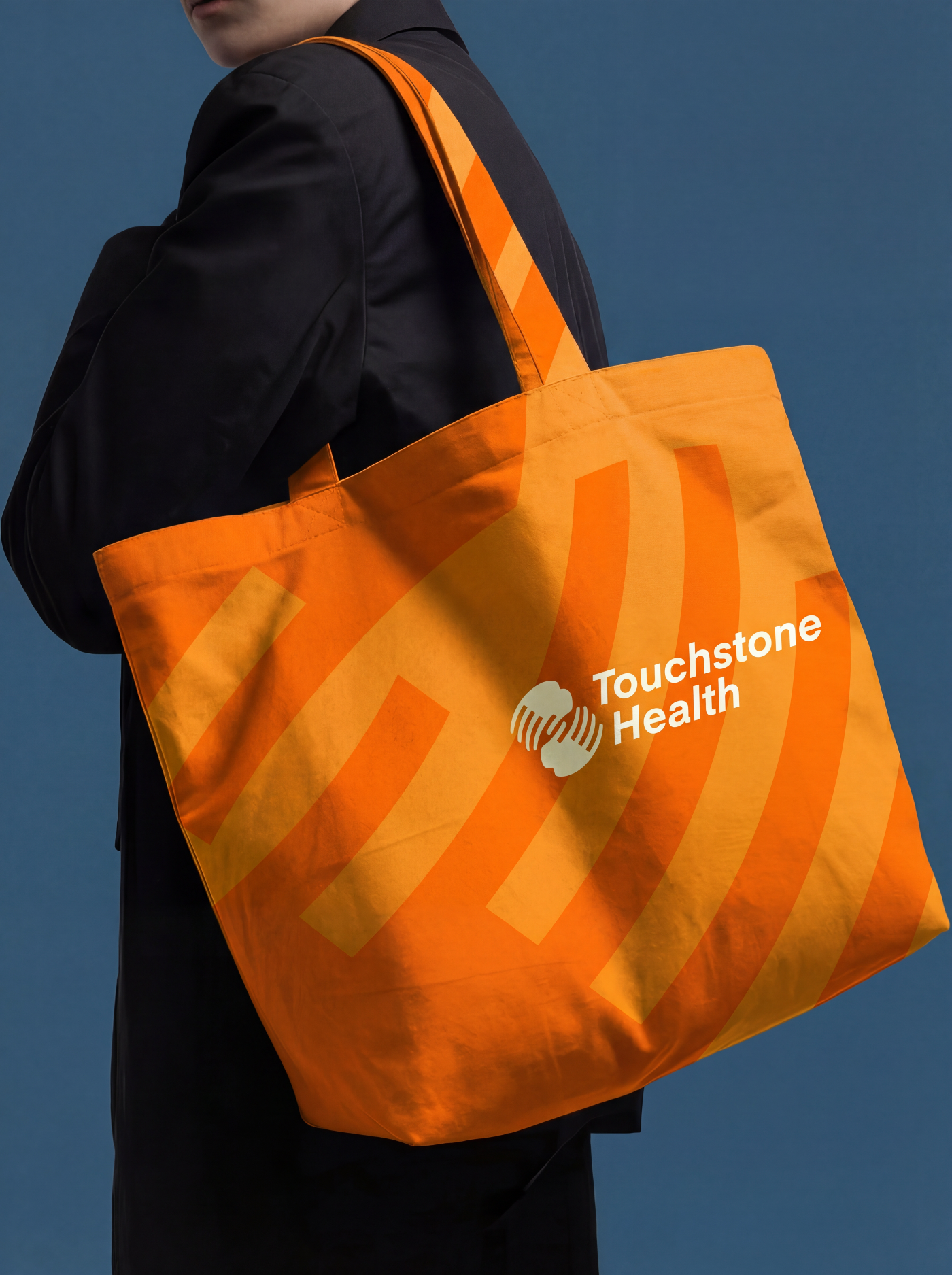
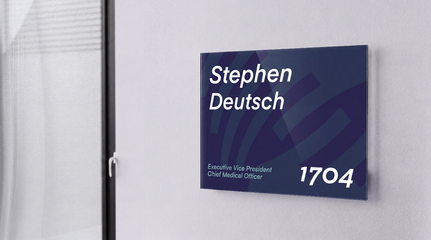
A brand system proves itself in the details. Vehicle wraps, employee badges, tote bags, staff apparel. Each touchpoint operates in a different context, at a different scale, for a different audience. The identity holds. The color system flexes between warm and cool spectrums without losing coherence. The logo reads at badge size and van size. When every surface feels like the same organization, the brand stops being a guideline and starts being a culture.